

Installation
Follow the steps below to get started with your Site Template:
- Open the
Package/HTMLFolder to find all the Templates Files - You will need to Upload these files to your Web Server using FTP in order to use it on your Website.
- Make sure you upload the required files/folders listed below:
HTML/css- Extra Stylesheets FolderHTML/include- Required PHP Functions FolderHTML/images- Images FolderHTML/js- Javacripts FolderHTML/style.css- Main Stylesheet FileHTML/index.html- Index File/Homepage
- You're now good to go..! Start adding your Content and show off your Brand New Beautiful Website in style.
HTML Structure
Canvas follows a simple coding structure. here is the sample:
<!DOCTYPE html>
<html dir="ltr" lang="en-US">
<head>

	<!-- Your Stylesheets, Scripts & Title
	============================================= -->
	...

</head>
<body>

	<!-- The Main Wrapper
	============================================= -->
	<div id="wrapper" class="clearfix">

		<!-- Header
		============================================= -->
		<header id="header">

			...

		</header>

		<!-- Site Content
		============================================= -->
		<section id="content">

			<div class="content-wrap">

				<div class="container clearfix">

					...

				</div>

			</div>

		</section>

		<!-- Footer
		============================================= -->
		<footer id="footer" class="dark">

			<div class="container">

				...

			</div>

			<!-- Copyrights
			============================================= -->
			<div id="copyrights">

				<div class="container clearfix">

					...

				</div>

			</div>

		</footer>

	</div>

</body>
</html>
Layout Settings
This Theme Supports both Boxed & Wide Layouts. Adding the class .stretched to the <body> will turn your website into a Wide Layout:
<body class="stretched">
Smooth Scrolling
Canvas enables Smooth Scrolling on Windows Desktop PCs for a Smooth Experience. You can disable it by simply adding the .no-smooth-scroll Class to the <body> Tag.
Favicons & Apple Touch Icons
You can add a Favicon to your Website using the following code:
<link rel="icon" href="favicon.png" type="image/png" sizes="16x16">
You can add Apple Touch Icons to your Website using the following code:
<link rel="apple-touch-icon" href="touch-icon-iphone.png">
<link rel="apple-touch-icon" sizes="76x76" href="touch-icon-ipad.png">
<link rel="apple-touch-icon" sizes="120x120" href="touch-icon-iphone-retina.png">
<link rel="apple-touch-icon" sizes="152x152" href="touch-icon-ipad-retina.png">
Page Loading Transitions
You can show Interactive loaders to your Visitors while the Pages of you Website loads in the background & then Reveal your Pages with CSS3 Transitions. Page Loading Transitions are enabled by default. To disable the Transition, you can simply add .no-transition Class to the <body> Tag.
<body class="no-transition">
You can customize the Transitions of your Pages Load using the following attributes:
data-animation-in- The Animation style on Page Load. Eg. fadeIndata-animation-out- The Animation style on Page Out. Eg. fadeOutdata-speed-in- The Speed of the Animation in milliseconds on Page Load. Eg. 1500data-speed-out- The Speed of the Animation in milliseconds on Page Out. Eg. 800data-loader- Loading Styles of the Animation. Eg. 2. Choose from 1, 2, 3, 4, 5, 6, 7, 8, 9, 10, 11, 12, 13 and 14data-loader-color- Any HEX Color for the Loader. Eg. #FF0000data-loader-timeout- Add a TimeOut in milliseconds to end the Page Preloader immaturely. Eg. 4000data-loader-html- Add Custom HTML Code for your Loader.
<body data-loader="2" data-animation-in="fadeIn" data-speed-in="1500" data-animation-out="fadeOut" data-speed-out="800">
Logo Settings
The Logo Container can be found in the Header Container - #header
<div id="logo">
	<a href="index.html" class="standard-logo" data-dark-logo="images/logo-dark.png"><img src="images/logo.png" alt="Canvas Logo"></a>
</div>
Note The Logo Image's maximum height can be 100px. Also make sure you also add the Dark Logo which provides even more intuitiveness when you switch between Light/Dark Scheme. However, it is optional.
Retina Logo
If you wish to use a Retina Logo, make sure that you use double the size of your Standard Logo. Use the code mentioned below instead of the above code:
<div id="logo">
	<a href="index.html" class="standard-logo" data-dark-logo="images/logo-dark.png"><img src="images/logo.png" alt="Canvas Logo"></a>
	<a href="index.html" class="retina-logo" data-dark-logo="images/logo-dark@2x.png"><img src="images/logo@2x.png" alt="Canvas Logo"></a>
</div>
Color Schemes
You can change your Website's Color Scheme in an instant. You simply need to change the HEX Color Code in the css/colors.css file & you are good to go. Follow these quick steps to get going:
-
Make sure you add the
css/colors.cssstylesheet in your head after the responsive stylesheets.<head> ... <link rel="stylesheet" href="css/responsive.css" type="text/css" /> <meta name="viewport" content="width=device-width, initial-scale=1, maximum-scale=1" /> <!--[if lt IE 9]> <script src="http://css3-mediaqueries-js.googlecode.com/svn/trunk/css3-mediaqueries.js"></script> <![endif]--> <!-- Here goes your colors.css ============================================= --> <link rel="stylesheet" href="css/colors.css" type="text/css" /> ... </head> - Now simply change the HEX Codes according to your requirements.
Dark Scheme
You can also completely change the Contrast of the Website to Dark, simply by adding the .dark Class to the body Tag. You can also add the .dark Class to certain elements like #header, #primary-menu, .section, Slides, #footer & many other elements. This will help you experimenting with different color schemes. The .dark Class will also be very helpful for turning the Texts of a container to light color.
Changing Fonts
Change your Fonts on the Fly as we have included a css/fonts.css file to manage the custom fonts you include with ease. By default, Canvas uses 3 Fonts namely: Raleway, Lato & Crete Round from the Google Fonts Library. You can find the Linking to the Font Files in the head tag of all the .html files.
<link href="http://fonts.googleapis.com/css?family=Lato:300,400,400italic,600,700|Raleway:300,400,500,600,700|Crete+Round:400italic" rel="stylesheet" type="text/css" />
In order to change the Fonts, you will need to Edit the Above Links with your Custom Font if you plan to use a Google Font or Remove it complete if you plan to use a Self Hosted font. Here is an Example for using Self Hosted Fonts.
You can now be able to change the Font Names in the css/fonts.css File.
Theme Customization
We have include a Custom CSS File in the css Folder so that you can better handle your Customizations while updating Canvas to the Latest Version. Simply add all your Custom CSS Codes in the css/custom.css File and link it in the Document <head> after the css/responsive.css Linking. Also make sure that this is the Last Linked CSS File in the Document <head> so that your Custom CSS Styles are Overwritten properly.
Example:
<head>

	...

	<link rel="stylesheet" href="css/responsive.css" type="text/css" />
	<meta name="viewport" content="width=device-width, initial-scale=1, maximum-scale=1" />
	<!--[if lt IE 9]>
		<script src="http://css3-mediaqueries-js.googlecode.com/svn/trunk/css3-mediaqueries.js"></script>
	<![endif]-->

	<!-- Here goes your custom.css
	============================================= -->
	<link rel="stylesheet" href="css/custom.css" type="text/css" />

</head>
Setting up RTL
We have included all the Tools to make your Website completely RTL ready. Simply follow the steps below:
- Add the
dir="rtl"to the<html>Tag. Example:<html dir="rtl" lang="ar">
- Add the RTL related CSS in the Document
<head>. Example:<head> <meta http-equiv="content-type" content="text/html; charset=utf-8" /> <meta name="author" content="SemiColonWeb" /> <!-- Stylesheets ============================================= --> <link href="http://fonts.googleapis.com/css?family=Lato:300,400,400italic,600,700|Raleway:300,400,500,600,700|Crete+Round:400italic" rel="stylesheet" type="text/css" /> <link rel="stylesheet" href="css/bootstrap.css" type="text/css" /> <link rel="stylesheet" href="css/bootstrap-rtl.css" type="text/css" /> <link rel="stylesheet" href="style.css" type="text/css" /> <link rel="stylesheet" href="style-rtl.css" type="text/css" /> <link rel="stylesheet" href="css/dark.css" type="text/css" /> <link rel="stylesheet" href="css/dark-rtl.css" type="text/css" /> <link rel="stylesheet" href="css/font-icons.css" type="text/css" /> <link rel="stylesheet" href="css/font-icons-rtl.css" type="text/css" /> <link rel="stylesheet" href="css/animate.css" type="text/css" /> <link rel="stylesheet" href="css/magnific-popup.css" type="text/css" /> <link rel="stylesheet" href="css/responsive.css" type="text/css" /> <link rel="stylesheet" href="css/responsive-rtl.css" type="text/css" /> <meta name="viewport" content="width=device-width, initial-scale=1" /> <!--[if lt IE 9]> <script src="http://css3-mediaqueries-js.googlecode.com/svn/trunk/css3-mediaqueries.js"></script> <![endif]--> <!-- Document Title ============================================= --> <title>Page | Canvas</title> </head>
- Add the
.rtlClass to the<body>Tag. Example:<body class="stretched rtl">
Setting up LESS CSS
-
Step 1:
Change all the following CSS Linking in your
<head>Tag:1. <link rel="stylesheet" href="style.css" type="text/css" /> 2. <link rel="stylesheet" href="css/dark.css" type="text/css" /> 3. <link rel="stylesheet" href="css/responsive.css" type="text/css" />
To their respective LESS Linking:
1. <link rel="stylesheet/less" href="style.less" type="text/less" />
2. <link rel="stylesheet/less" href="less/dark.less" type="text/less" />
3. <link rel="stylesheet/less" href="less/responsive.less" type="text/less" />
-
Step 2:
Add the LESS Script just after the
js/plugins.jsScript Linking in your<head>Tag:<script src="//cdnjs.cloudflare.com/ajax/libs/less.js/2.1.0/less.min.js"></script>
-
Step 3:
Open the
less/variables.lessand Edit the values according to your needs. If you need more Advanced Setup then you can Edit the Respective Files yourself which have been branched inside thelessFolder. It is completely at your discretion only to include the Required LESS Files you need to minimize the amount of CSS & including only the Styles of the Blocks you need. This can be setup in yourstyle.lessFile.
Note: LESS will work perfectly fine after compiling, but it can still be extended more. If you have any Suggestions to Improve or Requests to Add New Features to the LESS Files, then please Contact Us from Here.
Website Optimization Tips
A Fast & Optimized Website has several factors which needs to be implemented in order to achieve the desired results. There are several Optimization Techniques available which will definitely affect your Website's Performance in a Positive Way & we want to share a few of them with you:
-
gZip Compression & Browser Caching
This is probably one of the Most Important Techniques you should definitely implement in order to bump up your Website's Loading Speed. gZip Compression is used to compress the Files that are delivered when loading a Website. It covers HTML, CSS, Javascript & Font Files along with other miscellaneous text files. Where as Browser Caching also covers Images & Videos apart from including the above files. This is used to saves the Static Data in your Browser itself so that when you open the Next Pages on the Same Website, the content does not gets Downloaded again, loading the Website fast.
gZip Compression & Browser Caching can be enabled using the
.htaccessFile on an Apache Web Server. You can use the Codes from here: https://github.com/h5bp/html5-boilerplate/blob/master/dist/.htaccess to enable these modules on your server. -
Image Compression & Optimization
We tend to use Lots of Images on our Websites but we often do not make efforts to Compress & Optimize them. Remember, the Larger the Image, the more time it takes to download and therefore this slows your website loading times affecting User Experience. Your customer will leave your website if it does not load within 3-5 Seconds which adversely affects your Sales. Therefore, it is important to Resize, Optimize & Compress your Images before using it on your Website. Here are some Tips which might come handy in optimizing images:
- Resize your Images: Resize your Images before using it on your Website. Do not just Download an Image & place it as it is in your Website's
<img>Tag without resizing it. The size/resolution of the Image matters since it is not recommended to use an Image size of1200pxx800pxin a Content Size of300pxx200pxas this is unnecessary. Resize it to300pxx200px - Image Formats: There are three common file types that are used for web images which are JPEG, GIF, & PNG. For images with a Flat Background use JPEG images, for images with a Transparent background use PNG images and for images with Animations use GIF images.
- Compressing Images: Images Compression is important as it considerably reduces the size without losing the quality. There are several FREE Image Optimization Tools available to Download.
For MAC use ImageOptim
For Windows use Riot for compressing JPEG Images & PNG Gauntlet for PNG Images.
- Resize your Images: Resize your Images before using it on your Website. Do not just Download an Image & place it as it is in your Website's
-
CSS & jQuery Minifications
It is also recommended that you Combine & Minify all your CSS Files to a single CSS File & all Javascript Files to a single JS File since Minification reduces the size of the File and Combining the files helps in reducing the number of HTTP requests made to the server. This is also an Important Factor in increasing the speed of your website. There are several tools available online to Minify your CSS & JS Files. Our recommendations are:
For CSS use CSS Minifier and For Javascript use Javascript Minifier. -
Content Delivery Network
You can use a CDN to further speed up your website. You can use the CDN to deliver static files of your website like CSS, JS, Images & Font Files. There are several CDN Hosting Providers available on the Internet but we would recommend MaxCDN or CloudFlare. Note: CDN setup requires Extra monthly Fees to setup, so it is completely optional & according to your needs.
-
Fast Web Hosting Servers
A lot depends on your Web Hosting Servers, so it is recommended that you choose a Hosting Company/Server that provides a Reliable & a Fast Hosting Service. You can check out some recommended Hosting Services here: http://themeforest.net/get_hosting.
Upgrading Canvas: v3.x to v4.0
Canvas v4.0 is a Big Update and requires Changes to the CSS, JS, PHP and HTML Files. We have dramatically Improved Performance in this Version and making some changes were really necessary in order to Increase Flexibility and Stability. We have actually decreased the Size of the CSS Files to some extent without compromising on the Designs and Layouts allowing you more control on the Type of Content you want to Create with Canvas. We definitely understand that Upgrading Canvas from v3.x to v4.0 can be quite a task because of the Multipurpose Nature of Canvas and so we have included the Archived Version of Canvas v3.1.1 in the Package if in any case somethign goes wrong so that you can Rollback. The Full List of Changes are mentioned below:
Note: Always make sure that you have a Complete Backup of your Website before starting to Upgrade Canvas so that you Content is Safe and can be rolled back in case of any issues with Canvas 4.
CSS Files:
-
#primary-menuWe have updated the Primary Menu and Mega Menus to ensure more Flexibility and Less Code. The Mega Menus now uses the Bootstrap Grid allowing to create Mixed Columns and Widgets. It is recommended that you change the Entire Primary Menu related Code Blocks. If you have made any changes to the Original Code then keep a Backup of the Old Code and change the Codes accordingly comparing the New Codes.
Files Affected:style.css,css/responsive.css,css/dark.css,css/colors.css,css/colors.php -
#page-menuWe have updated the Page Menu Codes to handle the Dots Menu more efficiently on Responsive Devices. It is recommended that you change the Entire Page Menu related Code Blocks.
Files Affected:style.css,css/responsive.css,css/dark.css,css/colors.css,css/colors.php -
.slider-parallaxWe have updated the Slider Parallax Codes to address the flickr issue on Mac OS. It is recommended that you change the Entire Slider Parallax related Code Blocks.
Files Affected:style.css,css/responsive.css Swiper Slider Base CSSWe have removed the Swiper Slider Base CSS Codes and moved it to a Separate CSS File named
css/swiper.cssfor better handling of Swiper Plugin Updates. It is recommended that you remove this entire Code Blocks. Search for the following code in thestyle.cssFile:.swiper-container { margin:0 auto; position:relative; overflow:hidden; -webkit-backface-visibility:hidden; -moz-backface-visibility:hidden; -ms-backface-visibility:hidden; -o-backface-visibility:hidden; backface-visibility:hidden; /* Fix of Webkit flickering */ z-index:1; } ...
Files Affected:style.css-
#portfolioWe have updated the Entire Portfolio Code Block including the
#portfolio-filter,#portfolio-shuffleand#portfolio. All the IDs has been changed to Classes to allow Unlimited Portfolio Grids and Filters on a Single Page. We have also decreased the CSS Size. It is recommended that you change the Entire Portfolio related Code Blocks.
Files Affected:style.css,css/responsive.css,css/dark.css,css/colors.css,css/colors.php -
#shopWe have updated the Entire Shop & Products Code Blocks including the
#shopand.product. All the IDs has been changed to Classes to allow Unlimited Shop Grids on a Single Page. We have also decreased the CSS Size. It is recommended that you change the Entire Shop related Code Blocks.
Files Affected:style.css,css/responsive.css - All other Minor Changes has been described in the Changelog Section
PHP Files:
-
Form Processing and Subscription FilesWe have upgraded the PHP Files in the
includeFolder that handles the Form Email and Subscriptions to allow advanced handling of Data and better SPAM Protection. It now supports JSON Output so now the response shows Message Specific Alerts. It is recommended that you change the Form Processing and Mailchimp Subscription related Files. If you have made any changes to the Original Code then keep a Backup of the Old Code and change the Codes accordingly comparing the New Codes.
Files Affected: All PHP Files in theincludeFolder.
HTML Files:
-
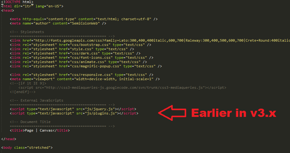
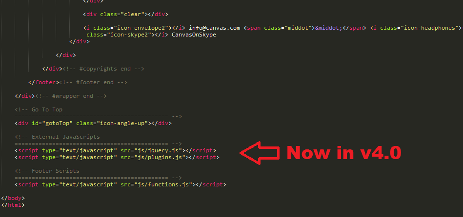
JS Files Linking moved to FooterKeeping performance in mind and Page Loading Speed, we have moved all the JS File Linking to the Footer of the HTML Files just before the
js/functions.jslinking. This helps in better Page Speed Performance and preventing in Render-Blocking Javascripts. Additionally, do make sure that now all the Inline JS Scripts used for JS Plugin Initialization have to be moved at the bottom too just after thejs/functions.jslinking.
Files Affected: All HTML Files.Example:
-
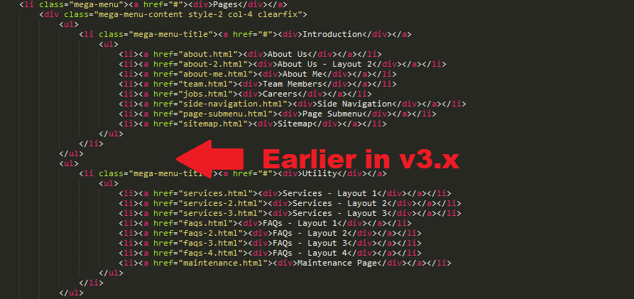
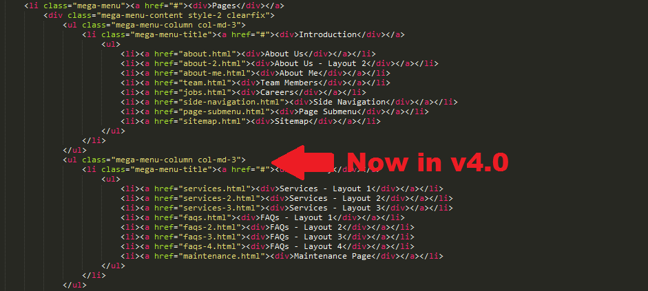
Mega Menu ContentMega Menu is now more Flexible than ever before as you can now add Widgets and use Mixed Width Columns powered by the Bootstrap Grid inside the Mega Menu Content.
Files Affected: All HTML Files with Mega Menu.Example:
-
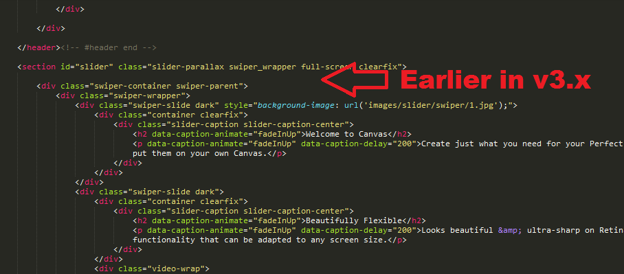
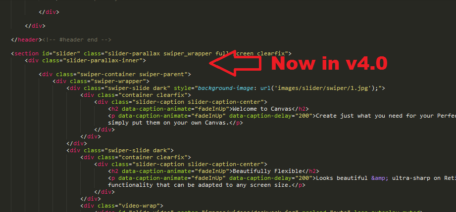
Slider ParallaxWe have fixed the issue with the Shaky and Flickering Slider Parallax on Safari on Mac OS. In order to fix this we will have to wrap the Slider Content inside another Container
.slider-parallax-innerwhich has Fixed Position and thus this fixes the Flicker. However, currently not all the Headers & Sliders are supported due to the Fixed Position nature of the.slider-parallax-innerContainer. It is best supported with Canvas Slider Templates at the moment.
Files Affected: Slider Templates with Transparent Header and Headers without Top Bars. Additionally, Headers with.sticky-style-2Class is not supported.Example:
-
Canvas/Swiper SliderYou will now need to add
css/swiper.cssin the Document<head>on all the Pages with Canvas/Swiper Slider. Also, the Canvas/Swiper Slider Javascript Initialization Code is not required anymore on the Page since it gets initialized using a Global Function. Please check the Slider > Canvas Slider Section for Full Documeentation.
Files Affected: All HTML Files with Canvas/Swiper Slider. -
Page MenuWe have updated the Page Menu Link Item Markup slightly to handle the Dots Menu more efficiently on Responsive Devices. All the Link Item Texts inside the Page Menu are now enclosed inside a
<div>.
Files Affected: All the HTML Pages with#page-menu.Before:
<!-- Page Sub Menu
============================================= -->
<div id="page-menu">

	<div id="page-menu-wrap">

		<div class="container clearfix">

			<div class="menu-title">Explore <span>CANVAS</span></div>

			<nav>
				<ul>
					<li class="current"><a href="#">Gallery</a></li>
					<li><a href="#">Features</a></li>
					<li><a href="#">Models</a>
						<ul>
							<li><a href="#">Small Size</a></li>
							<li><a href="#">Normal Size</a></li>
							<li><a href="#">Large Size</a></li>
						</ul>
					</li>
					<li><a href="#">Reviews</a>
						<ul>
							<li><a href="#">Expert Reviews</a></li>
							<li><a href="#">User Reviews</a></li>
						</ul>
					</li>
					<li><a href="#">Compare</a></li>
					<li><a href="#">Build</a></li>
					<li><a href="#">Order</a></li>
				</ul>
			</nav>

		<div id="page-submenu-trigger"><i class="icon-reorder"></i></div>

		</div>

	</div>

</div><!-- #page-menu end -->
After:
<!-- Page Sub Menu
============================================= -->
<div id="page-menu">

	<div id="page-menu-wrap">

		<div class="container clearfix">

			<div class="menu-title">Explore <span>CANVAS</span></div>

			<nav>
				<ul>
					<li class="current"><a href="#"><div>Gallery</div></a></li>
					<li><a href="#"><div>Features</div></a></li>
					<li><a href="#"><div>Models</div></a>
						<ul>
							<li><a href="#"><div>Small Size</div></a></li>
							<li><a href="#"><div>Normal Size</div></a></li>
							<li><a href="#"><div>Large Size</div></a></li>
						</ul>
					</li>
					<li><a href="#"><div>Reviews</div></a>
						<ul>
							<li><a href="#"><div>Expert Reviews</div></a></li>
							<li><a href="#"><div>User Reviews</div></a></li>
						</ul>
					</li>
					<li><a href="#"><div>Compare</div></a></li>
					<li><a href="#"><div>Build</div></a></li>
					<li><a href="#"><div>Order</div></a></li>
				</ul>
			</nav>

		<div id="page-submenu-trigger"><i class="icon-reorder"></i></div>

		</div>

	</div>

</div><!-- #page-menu end -->
-
Isotope GridsTo simplify things and to initilaize the Isotope on any Grid, you will simply need to add the
.grid-containerClass to the Container. So, the Isotope Javascript Initialization Code is not required anymore on the Page.
Files Affected: All HTML Files with a Masonry Grid.Additional Options:
data-transition- Transition Speed of the Isotope Grid in seconds. Eg. 0.65data-layout- Layout of the Isotope Grid. Eg. masonry . More Layout Options
-
PortfolioPortfolio Grid now needs the
.portfolioClass which allows Unlimited Portfolio Grids on a Single Page. To initilaize the Isotope on the Portfolio Grid, you will simply need to add the.grid-containerClass to the.portfolioContainer. So, the Isotope Javascript Initialization Code is not required anymore on the Page.
Files Affected: All HTML Files with Portfolio Grid.Before:
<div id="portfolio" class="clearfix">
After:
<div id="portfolio" class="portfolio grid-container clearfix">
-
Portfolio FilterPortfolio Filter now needs the
.portfolio-filterClass which allows Unlimited Portfolio Filters on a Single Page. To activate the Filter on a Portfolio Grid, you will simply need to add thedata-container="#portfolio"Attribute to the.portfolio-filterElement. So, the Isotope Filter Javascript Code is not required anymore on the Page.
Files Affected: All HTML Files with Portfolio Filter.Example:
<ul class="portfolio-filter clearfix" data-container="#portfolio">
-
Portfolio ShufflePortfolio Shuffle now needs the
.portfolio-shuffleClass which allows Unlimited Portfolio Shuffles on a Single Page. To activate the Shuffle Functionality on a Portfolio Grid, you will simply need to add thedata-container="#portfolio"Attribute to the.portfolio-shuffleElement. So, the Isotope Shuffle Javascript Code is not required anymore on the Page.
Files Affected: All HTML Files with Portfolio Shuffle.Example:
<div class="portfolio-shuffle" data-container="#portfolio">
-
ShopShop Grid now needs the
.shopClass which allows Unlimited Shop Grids on a Single Page. To initilaize the Isotope on the Shop Grid, you will simply need to add the.grid-containerClass to the.shopContainer. So, the Isotope Javascript Initialization Code is not required on the Page.
Files Affected: All HTML Files with Shop Grid.Before:
<div id="shop" class="clearfix">
After:
<div id="shop" class="shop grid-container clearfix" data-layout="fitRows">
-
Blog GridTo initilaize the Isotope on the Blog Grid, you will simply need to add the
.grid-containerClass to the#postsContainer. So, the Isotope Javascript Initialization Code is not required anymore on the Page.
Files Affected: All HTML Files with Blog Grid.Before:
<div id="posts" class="post-grid clearfix">
After:
<div id="posts" class="post-grid grid-container clearfix" data-layout="fitRows">
-
Blog Masonry GridTo initilaize the Isotope on the Blog Masonry Grid, you will simply need to add the
.grid-containerClass to the#postsContainer. So, the Isotope Javascript Initialization Code is not required anymore on the Page.
Files Affected: All HTML Files with Blog Masonry Grid.Before:
<div id="posts" class="post-grid post-masonry clearfix">
After:
<div id="posts" class="post-grid post-masonry grid-container clearfix">
-
Contact FormsContact Form markup has been changed slightly to allow unlimited Contact Forms on a Single Page without the hassle of Adding Additional JS Codes for each Contact Form. The Entire Contact Form is now enclosed within the
.contact-widgetContainer and the Contact Form Results container has been replaced.Before:
<div id="contact-form-result" data-notify-type="success" data-notify-msg="<i class=icon-ok-sign></i> Message Sent Successfully!"></div>
After:
<div class="contact-form-result"></div>
The Contact Form Javascript Initialization Code is not required anymore on the Page.
Files Affected: All HTML Files with Contact Forms. -
Quick Contact FormsQuick Contact Form markup has been changed slightly to allow unlimited Quick Contact Forms on a Single Page without the hassle of Adding Additional JS Codes for each Quick Contact Form. The Quick Contact Form Results container has been replaced.
Before:
<div id="quick-contact-form-result" data-notify-type="success" data-notify-msg="<i class=icon-ok-sign></i> Message Sent Successfully!"></div>
After:
<div class="quick-contact-form-result"></div>
The Quick Contact Form Javascript Initialization Code is not required anymore on the Page.
Files Affected: All HTML Files with Quick Contact Forms. -
Subscription FormsSubscription Form markup has been changed slightly to allow unlimited Subscription Forms on a Single Page without the hassle of Adding Additional JS Codes for each Subscription Form. The Subscription Form Results container has been replaced.
Before:
<div id="widget-subscribe-form-result" data-notify-type="success" data-notify-msg=""></div>
After:
<div class="widget-subscribe-form-result"></div>
The Subscription Form Javascript Initialization Code is not required anymore on the Page.
Files Affected: All HTML Files with Subscription Forms. -
Canvas Slider JavascriptCanvas Slider Initialization Javascript is no Longer required on the Page, so please remove it. To initilaize the Canvas Slider please refer to the Documentation > Sliders > Canvas Slider Section.
Files Affected: All HTML Files with Canvas Slider. -
Owl Carousel JavascriptOwl Carousel Initialization Javascript is no Longer required on the Page, so please remove it. To initilaize the Owl Carousel please refer to the Documentation > Shortcodes > Owl Carousel Section.
Files Affected: All HTML Files with Owl Carousel.
Header Types
You can choose between 7 Types of headers while creating your Pages. Simply adding the Header Type CSS class to the Header Element will activate the Header Type. The list of Header Type Classes & its descriptions are provided below for your reference:
| Type Class | Features | Code Example |
|---|---|---|
Default |
Default Header with a White Background & Dark text. |
<header id="header"> ... </header> |
.dark |
Header with a Dark Background & Light text. |
<header id="header" class="dark"> ... </header> |
.transparent-header |
Header with a Transparent Background. This header is effective for showing Sliders or other types of Hero Images on the Top with a Transparent Logo & Menu. You can add the dark class for a Light Colored Text. |
<header id="header" class="transparent-header"> ... </header> |
.semi-transparent |
Header with a Semi Transparent Background. You can add the dark class for a Light Colored Text & a Dark Background. |
<header id="header" class="transparent-header semi-transparent"> ... </header> |
.floating-header |
This activates the Floating Header. You can add the dark class for a Light Colored Text & a Dark Background. |
<header id="header" class="transparent-header floating-header"> ... </header> |
.side-header |
This is a Side Header Left Aligned. Unlike the above Headers, this class should be added to the body. |
<body class="stretched side-header"> <header id="header"> ... </header> ... </body> |
.open-header |
This is a Side Header Left Aligned which is hidden by default & opens via a Trigger. Unlike the above Headers, this class should be added to the body. This class can only be used for the Side Headers. If you want to close the Side Header on scrolling, please add the .close-header-on-scroll class to the body tag. |
<body class="stretched side-header open-header"> <header id="header"> ... </header> ... </body> |
.push-wrapper |
This is a Side Header Left Aligned which is hidden by default & opens via a Trigger. When the Header opens, it also pushes the wrapper to the right. Unlike the above Headers, this class should be added to the body. This class can only be used for the Side Headers. If you want to close the Side Header on scrolling, please add the .close-header-on-scroll class to the body tag. |
<body class="stretched side-header open-header push-wrapper"> <header id="header"> ... </header> ... </body> |
.side-header-right |
This is a Side Header Right Aligned. Unlike the above Headers, this class should be added to the body. You can easily add the .open-header & .push-wrapper classes to the body tag to make this Side Header follow the above behaviours. |
<body class="stretched side-header side-header-right"> <header id="header"> ... </header> ... </body> |
Helper Classes
Use these handy Helper Classes with the Headers making them more flexible than you can imagine.
| Helper Class | Description |
|---|---|
.no-sticky |
Disable Stickiness of the Header. Use it on the header tag. |
.static-sticky |
Disable Resizing when Headers turn Sticky. Use it on the header tag. |
data-sticky-class |
Use a different Header Style when it gets Sticky. This will look something like this:<header class="dark" data-sticky-class="not-dark">You can use these classes: .dark, .not-dark, .semi-transparent. Remember, if you use the .semi-transparent Class, then you'll also need to include the .transparent Class.
|
.not-dark |
This is a Handy Class, if you want to use Mixins. Suppose, You want to use the Dark Header Style, but dont want the Dropdown Menus to be Dark too, then you can simply add this class to the Primary Menu and you are good to go. Example: <nav id="primary-menu" class="not-dark"> |
Modifying Header Height
You can change the Default header height of100px to any other Height according to your Requirements. Simply use the following CSS Codes:
#header,
#header-wrap,
#logo,
#logo img,
#primary-menu:not(.style-2),
#primary-menu:not(.style-2) > ul,
#primary-menu,
#primary-menu ul,
#primary-menu ul li a { height: 100px; }

#primary-menu ul li a { line-height: 100px; }

#primary-menu ul li i { line-height: 99px; }

#primary-menu ul ul,
#primary-menu ul li .mega-menu-content,
#primary-menu ul li.mega-menu .mega-menu-content { top: 100px; }

#primary-menu.sub-title ul li a { padding: 27px 20px 32px; }

#top-search,
#top-cart { margin: 40px 0 40px 15px; }

@media (max-width: 991px) {
	#primary-menu-trigger { top: 25px; }
	#top-search a { margin-top: 40px; }
	#top-search form { height: 100px !important; }
}
Page Titles
| Class | Description | Example |
|---|---|---|
Default |
Default Page Title style with Text aligned Left & Breadcrumbs Right. |
<section id="page-title"> <div class="container clearfix"> <h1>Page Title</h1> <span>A Short Page Title Tagline</span> <ol class="breadcrumb"> <li><a href="#">Home</a></li> <li><a href="#">Shortcodes</a></li> <li class="active">Page Titles</li> </ol> </div> </section> |
.page-title-right |
Page Title style with Text aligned Right & Breadcrumbs Left. |
<section id="page-title" class="page-title-right"> <div class="container clearfix"> <h1>Page Title Right</h1> <span>A Short Page Title Tagline</span> <ol class="breadcrumb"> <li><a href="#">Home</a></li> <li><a href="#">Shortcodes</a></li> <li class="active">Page Titles</li> </ol> </div> </section> |
.page-title-center |
Page Title style with Text & Breadcrumbs aligned Center. |
<section id="page-title" class="page-title-center"> <div class="container clearfix"> <h1>Page Title Center</h1> <span>A Short Page Title Tagline</span> <ol class="breadcrumb"> <li><a href="#">Home</a></li> <li><a href="#">Shortcodes</a></li> <li class="active">Page Titles</li> </ol> </div> </section> |
.page-title-mini |
Page Title style with Mini Title. |
<section id="page-title" class="page-title-mini"> <div class="container clearfix"> <h1>Page Title Mini</h1> <span>A Short Page Title Tagline</span> <ol class="breadcrumb"> <li><a href="#">Home</a></li> <li><a href="#">Shortcodes</a></li> <li class="active">Page Titles</li> </ol> </div> </section> |
.page-title-dark |
Page Title style with Background Color Dark. |
<section id="page-title" class="page-title-dark"> <div class="container clearfix"> <h1>Page Title Dark</h1> <span>A Short Page Title Tagline</span> <ol class="breadcrumb"> <li><a href="#">Home</a></li> <li><a href="#">Shortcodes</a></li> <li class="active">Page Titles</li> </ol> </div> </section> |
.page-title-nobg |
Page Title style with Background Color Transparent. |
<section id="page-title" class="page-title-nobg"> <div class="container clearfix"> <h1>Page Title No BG</h1> <span>A Short Page Title Tagline</span> <ol class="breadcrumb"> <li><a href="#">Home</a></li> <li><a href="#">Shortcodes</a></li> <li class="active">Page Titles</li> </ol> </div> </section> |
.page-title-pattern |
Page Title style with a Background Pattern. |
<section id="page-title" class="page-title-pattern"> <div class="container clearfix"> <h1>Page Title with Pattern</h1> <span>A Short Page Title Tagline</span> <ol class="breadcrumb"> <li><a href="#">Home</a></li> <li><a href="#">Shortcodes</a></li> <li class="active">Page Titles</li> </ol> </div> </section> |
.page-title-parallax |
Page Title style with a Parallax Image. |
<section id="page-title" class="page-title-parallax page-title-dark" style="background-image: url('');"
	data-stellar-background-ratio="0.3">

		<div class="container clearfix">
			<h1>Page Title Parallax</h1>
			<span>A Short Page Title Tagline</span>
			<ol class="breadcrumb">
				<li><a href="#">Home</a></li>
				<li><a href="#">Shortcodes</a></li>
				<li class="active">Page Titles</li>
			</ol>
		</div>

	</section>
|
.page-title-video |
Page Title style with a HTML5 Video. |
<section id="page-title" class="page-title-parallax page-title-dark page-title-video"> <div class="video-wrap"> <video width="100%" src="images/videos/deskwork.mp4" preload="auto" loop autoplay muted></video> <div class="video-overlay"></div> </div> <div class="container clearfix"> <h1>Page Title Video</h1> <span>A Short Page Title Tagline</span> <ol class="breadcrumb"> <li><a href="#">Home</a></li> <li><a href="#">Shortcodes</a></li> <li class="active">Page Titles</li> </ol> </div> </section> |
Columns & Grid
Canvas Grid
Bootstrap Grid
Isotope Initialization
You can initialize Isotope on any Grid Container by simply adding the .grid-container Class on the Container that holds the Grid. This is Best Effective on the Portfolio, Blog & Shop Grids.
Example:
<!-- Portfolio Items
============================================= -->
<div id="portfolio" class="portfolio grid-container clearfix">
	...
</div>
Settings:
data-transition- Transition Speed of the Isotope Grid in seconds. Eg. 0.65data-layout- Layout of the Isotope Grid. Eg. masonry . More Layout Options
Side Panel
You can add a revealable Side Panel on your Website with Additional Information about your Website. Simply use the Code below:
<div class="body-overlay"></div>

<div id="side-panel" class="dark">

	<div id="side-panel-trigger-close" class="side-panel-trigger"><a href="#"><i class="icon-line-cross"></i></a></div>

	<div class="side-panel-wrap">

		... Your Content

	</div>

</div>
Note: Make sure that you add the Side Panel's Code just after the #wrapper Starts.
Side Panel Position
A Side Panel can be revealed from either Left or Right. The Side Panel is revealed from the Right by default. If you would like to change the Reveal Position of the Side Panel to Left, then you can simply add the .side-panel-left Class to the <body> Tag.
<body class="stretched side-panel-left">
Side Panel Reveal Style
The Side Panel's Reveal style is Overlay by default. If you would like to change the Reveal Style of the Side Panel to Push, then you can simply add the .side-push-panel Class to the <body> Tag.
<body class="stretched side-push-panel">
Go To Top
You can add a Go To Top Trigger on your Page to allow your users to scroll to the Top of the Page anytime they need to. Simply add the code below at the bottom of the page just after the </wrapper> ends:
<div id="gotoTop" class="icon-angle-up"></div>
Settings:
data-offset- Offset from Top when you would like the Go To Top Trigger to appear in pixels. Eg.300data-mobile- Enable/Disable Go To Top on Mobile. Eg.true/falsedata-speed- Speed of the Go To Top Scrolling in milliseconds. Eg.800data-easing- Easing of the Go To Top Scrolling. Eg.easeInQuad
Helper Classes
We have created some really useful helper classes for you. Here are a few of them:
.allmargin- Margin of 50px on all sides..topmargin- Margin of 50px on the top side..bottommargin- Margin of 50px on the bottom side..leftmargin- Margin of 50px on the left side..rightmargin- Margin of 50px on the right side..allmargin-sm- Margin of 30px on all sides..topmargin-sm- Margin of 30px on the top side..bottommargin-sm- Margin of 30px on the bottom side..leftmargin-sm- Margin of 30px on the left side..rightmargin-sm- Margin of 30px on the right side..allmargin-lg- Margin of 80px on all sides..topmargin-lg- Margin of 80px on the top side..bottommargin-lg- Margin of 80px on the bottom side..leftmargin-lg- Margin of 80px on the left side..rightmargin-lg- Margin of 80px on the right side..nomargin- No Margin on all sides..notopmargin- No Margin on the top side..nobottommargin- No Margin on the bottom side..noleftmargin- No Margin on the left side..norightmargin- No Margin on the right side..header-stick- Sticks content with the Header..footer-stick- Sticks content with the Footer..noborder- No Border on all sides..notopborder- No Border on the top side..nobottomborder- No Border on the bottom side..noleftborder- No Border on the left side..norightborder- No Border on the right side..nopadding- No Padding on all sides..notoppadding- No Padding on the top side..nobottompadding- No Padding on the bottom side..noleftpadding- No Padding on the left side..norightpadding- No Padding on the right side..col-padding- Padding of 60px on all sides..noradius- No Border Radius..noshadow- No Box Shadows..nobg- No Backgrounds..nobgcolor- No Background Colors..noabsolute- Forces Relative Position..hidden- Hidden Blocks..nothidden- No Hidden Blocks..inline-block- Inline Blocks..center- Center Aligned Text..tright- Right Aligned Text..divcenter- Center Aligned DIVs..fleft- Left Aligned DIVs..fright- Right Aligned DIVs..color- Theme Text Color..bgcolor- Theme Background Color..border-color- Theme Border Color..bgicon- Background Icon..bganimate- Animates Background Vertically..grayscale- Adds a Grayscale Filter to the Images and Colors on Hover..imagescale- Adds a Zoom Out Effect on the Image when Hovered..t300- Changes the Font Weight to Light..t400- Changes the Font Weight to Normal..t500- Changes the Font Weight to Medium..t600- Changes the Font Weight to Semi Bold..t700- Changes the Font Weight to Bold..ls1- Adds a Letter Spacing of 1px..ls2- Adds a Letter Spacing of 2px..ls3- Adds a Letter Spacing of 3px..ls4- Adds a Letter Spacing of 4px..ls5- Adds a Letter Spacing of 5px..noheight- Changes the Height of the Element to 0px..nolineheight- Changes the Line Height of the Element to 0px..font-body- Changes the Font Family of the Element equal to the one used for the Body Text..font-primary- Changes the Font Family of the Element equal to the one used for the Primary Text..font-secondary- Changes the Font Family of the Element equal to the one used for the Secondary Text.
Useful Snippets
We have created some really useful functionality which surely going to make your Website more interactive. Here are a few of them:
Smooth Scrolling to Same Page Sections
With Canvas you can turn pretty-much any Page into a One Page Website, which defines Smart Functionality. You can Point any Link, Button on a Page to an Element ID which on Clicking scrolls to that Element.
You can use this functionality by adding data-scrollto="#html-element-ID" attribute to a Button or a Link. Simply use the following Sample Code to use this functionality:
<a href="#header" data-scrollto="#header" class="button button-3d">Scroll to Header</a>
Note: You should have a Valid & Unique Element ID on the Page where you are planning to use the ScrollTo Functionality.
Responsive Absolute Heights
This is a Very Interesting Feature of Canvas of defining Responsive Heights. But it is recommended that it is used only on the Absolutely positioned elements as the Relatively positioned elements are auto-heights. You can define Responsive Heights for an Element using the data-height attribute:
data-height-lg- Height for Large Devices >=1200pxdata-height-md- Height for Medium Devices >=992px to 1199pxdata-height-sm- Height for Tabletsdata-height-xs- Height for Landscape Mobiles or Phabletsdata-height-xxs- Height for Portrait Mobiles
Sample Code:
<div style="position: relative; margin-bottom: -60px;" class="ohidden" data-height-lg="426" data-height-md="567" data-height-sm="470" data-height-xs="287" data-height-xxs="183">
	<img src="images/services/main-fbrowser.png" style="position: absolute; top: 0; left: 0;" data-animate="fadeInUp" data-delay="100" alt="Chrome">
	<img src="images/services/main-fmobile.png" style="position: absolute; top: 0; left: 0;" data-animate="fadeInUp" data-delay="400" alt="iPad">
</div>
Note: Width of the Image is flexible depending on the Parent Container. Now, the Large Device will have the Default Height of your Image and the other heights can be checked simply by resizing your browser to see the image heights change, so you can define the other heights accordingly. We guess, this will surely serve you well. But do remember, this should only be used on absolutely positioned elements.
Responsive Classes
Now you can add Responsive Classes to an Element that switches on Different Devices. You can define Responsive Classes for an Element using the data-class attribute:
data-class-lg- Classes for Large Devices >=1200pxdata-class-md- Classes for Medium Devices >=992px to 1199pxdata-class-sm- Classes for Tabletsdata-class-xs- Classes for Landscape Mobiles or Phabletsdata-class-xxs- Classes for Portrait Mobiles
Sample Code:
<a href="#" class="button" data-class-lg="button-large" data-class-md="" data-class-sm="button-xlarge" data-class-xs="button-small" data-class-xxs="button-mini">Button</a>
Note: Make sure that if you intend to use the Responsive Classes Functionality, then you add the data-class-* Variations for all the Devices, since this will ensure that your Defined Classes are Applied on Window Load of that Particular Device as well.
Slider Types & their Options
Canvas includes 7 Unique Sliders & 20+ Pre-Built Slider Templates for you to be used on any Page with 100s of Options. The List of all the Sliders included are mentioned as follows:
- Revolution Slider
- Canvas Swiper Slider
- Flex Slider
- Owl Slider
- Camera Slider
- Elastic Slider
- Nivo Slider
Revolution Slider
You can find the Revolution Slider related Documentation here.
Read Revolution Slider Docs
Canvas Swiper Slider
Usage:
Here is the HTML Code for the Canvas Swiper Slider:
<section id="slider" class="slider-parallax swiper_wrapper full-screen clearfix">
	<div class="swiper-container">
		<div class="swiper-wrapper">
			<!--First Slide-->
			<div class="swiper-slide">
			<!-- Any HTML content of the first slide goes here -->
			</div>

			<!--Second Slide-->
			<div class="swiper-slide">
			<!-- Any HTML content of the second slide goes here -->
			</div>

			<!--Third Slide-->
			<div class="swiper-slide">
			<!-- Any HTML content of the third slide goes here -->
			</div>
			<!--Etc..-->
		</div>
	</div>
</section>
Note: You can use the "dark" class on .swiper-slide element, to make the Caption Content & the Header Scheme(only on Transparent Header) "Dark".
Setting Slider Height:
<div id="slider" class="slider-parallax swiper_wrapper clearfix" style="height: 400px;">
	...
</div>
Settings:
data-direction- Direction of the Slide Animation. Eg. horizontal/verticaldata-speed- Speed of the Slide Animation in milliseconds. Eg. 500data-autoplay- Pause Time between Slide's Autoplay Transition in milliseconds. Eg. 5000data-loop- Enable/Disable Slider Loop. Eg. true/falsedata-effect- Slide Effect. Eg. slide/fade/cube/coverflow/flipdata-grab- Enable/Disable Grab Cursor. Eg. true/falsedata-video-autoplay- Enable/Disable Video Autoplay. Eg. true/false
To disable the Pagination, Slider Next/Prev Arrows, simply remove the related HTML Codes.
Example:
<section id="slider" class="slider-parallax swiper_wrapper full-screen clearfix" data-speed="600" data-loop="true">
	<div class="swiper-container">
		<div class="swiper-wrapper">
			<!--First Slide-->
			<div class="swiper-slide">
			<!-- Any HTML content of the first slide goes here -->
			</div>

			<!--Second Slide-->
			<div class="swiper-slide">
			<!-- Any HTML content of the second slide goes here -->
			</div>

			<!--Third Slide-->
			<div class="swiper-slide">
			<!-- Any HTML content of the third slide goes here -->
			</div>
			<!--Etc..-->
		</div>
	</div>
</section>
Initializing Canvas Swiper Slider using Custom Javascript
Canvas Swiper Sliders are initialized using the Standard Minimal Functionality by default, but there might instances when you would have to Create a Custom Functionality. To use this you can simply add the .customjs Class to #slider Container as this will stop it from using the Default Functionality and allow you to extend the Slider with your own Custom Functionality.
You can find more Canvas Swiper Slider related Settings for Custom JS Initialization here.
Canvas Swiper Slider Documentation
Slider Captions
You can Add Captions to your Slides using a no. of Classes described below:
| Caption Class | Description | Works on |
|---|---|---|
.slider-caption |
Creates a Caption on the Canvas Slider | Canvas Swiper Slider |
.flex-caption |
Creates a Caption on Flex Slider, Owl Slider & Camera Slider | Flex Slider Owl Slider Camera Slider with .camera-caption |
.nivo-caption |
Creates a Caption on the Nivo Slider | Nivo Slider |
.ei-title |
Creates a Caption on the Elastic Slider | Elastic Slider |
.slider-caption-right |
Positions the Caption to the Right on the Canvas Swiper Slider | Canvas Swiper Slider |
.slider-caption-center |
Positions the Caption in the Center on the Canvas Swiper Slider | Canvas Swiper Slider |
.slider-caption-top-left |
Positions the Caption to the Top Left on Flex Slider & Owl Slider | Flex Slider Owl Slider |
.slider-caption-top-right |
Positions the Caption to the Top Right on Flex Slider & Owl Slider | Flex Slider Owl Slider |
.slider-caption-bottom-right |
Positions the Caption to the Bottom Right on Flex Slider & Owl Slider | Flex Slider Owl Slider |
.slider-caption-bg |
Provides a Dark background for the Caption on Flex Slider, Owl Slider & Camera Slider | Flex Slider Owl Slider Camera Slider with .camera-caption |
.slider-caption-bg.slider-caption-bg-light |
Provides a Light background for the Caption on Flex Slider, Owl Slider & Camera Slider | Flex Slider Owl Slider Camera Slider with .camera-caption |
Slider Helper Classes
We have created some helper classes for the Sliders. Here are a few of them:
.slider-parallax- Enables Parallax Functionality for the Slider Element..boxed-slider- Makes the Slider Boxed within the Container..full-screen- Makes the Slider Full Screen..with-header- Makes the Slider Full Screen with Header Height included..full-screenclass should also be included.
Blog Setup
Posts use Simple Markup. Use the Code Sample below:
<div id="posts">

	<div class="entry clearfix">

		<!-- Post Image -->
		<div class="entry-image">
			<a href="image.jpg" data-lightbox="image"><img class="image_fade" src="image.jpg" alt="Standard Post with Image"></a>
		</div>

		<!-- Post Title -->
		<div class="entry-title">
			<h2><a href="blog-single.html">This is a Standard post with a Preview Image</a></h2>
		</div>

		<!-- Post Meta -->
		<ul class="entry-meta clearfix">
			<li><i class="icon-calendar3"></i> 10th February 2014</li>
			<li><a href="#"><i class="icon-user"></i> admin</a></li>
			<li><i class="icon-folder-open"></i> <a href="#">General</a>, <a href="#">Media</a></li>
			<li><a href="blog-single.html#comments"><i class="icon-comments"></i> 13 Comments</a></li>
			<li><a href="#"><i class="icon-camera-retro"></i></a></li>
		</ul>

		<!-- Post Content -->
		<div class="entry-content">
			<p>Lorem ipsum dolor sit amet, consectetur adipisicing elit. Cupiditate, asperiores quod est tenetur in. Eligendi, deserunt, blanditiis est quisquam doloribus voluptate id aperiam ea ipsum magni aut perspiciatis rem voluptatibus officia eos rerum deleniti quae nihil facilis repellat atque vitae voluptatem libero at eveniet veritatis ab facere.</p>
			<a href="blog-single.html">Read More →</a>
		</div>

	</div>

	...

</div>
Post Types
You can use a 7 different types of Post Types:
- Image
- Embedded Video
- Slider Gallery
- Gallery Thumbs
- Blockquotes
- Link
- Status
- Embedded Audio
Comment Types
You can use a 3 different types of Comments System on Post Single Pages:
- Default
- Disqus
Facebook Comments
Code Sample for Facebook Comments:
<div id="comments" class="clearfix">

	<h3 id="comments-title"><span><fb:comments-count href="your-post-full-url"></fb:comments-count></span> Comments</h3>

	<!-- Facebook Comments
	============================================= -->
	<div class="fb-comments" data-width="100%" data-href="your-post-full-url" data-numposts="5" data-colorscheme="light"></div>
	<!-- Facebook Comments end -->

</div>
Note: You'll need to place the following code just after the body tag of your HTML document.
<div id="fb-root"></div>
<script>(function(d, s, id) {
	var js, fjs = d.getElementsByTagName(s)[0];
	if (d.getElementById(id)) return;
	js = d.createElement(s); js.id = id;
	js.src = "//connect.facebook.net/en_US/sdk.js#xfbml=1&appId={your-app-id}&version=v2.0";
	fjs.parentNode.insertBefore(js, fjs);
}(document, 'script', 'facebook-jssdk'));</script>
Disqus Comments
Code Sample for Disqus Comments:
<div id="comments" class="clearfix">

	<h3 id="comments-title">Comments</h3>

	<!-- Disqus Comments
	============================================= -->
	<div id="disqus_thread"></div>
	<script type="text/javascript">
		/* * * CONFIGURATION VARIABLES: EDIT BEFORE PASTING INTO YOUR WEBPAGE * * */
		var disqus_shortname = 'your-disqus-shortname'; // required: replace example with your forum shortname

		/* * * DON'T EDIT BELOW THIS LINE * * */
		(function() {
			var dsq = document.createElement('script'); dsq.type = 'text/javascript'; dsq.async = true;
			dsq.src = '//' + disqus_shortname + '.disqus.com/embed.js';
			(document.getElementsByTagName('head')[0] || document.getElementsByTagName('body')[0]).appendChild(dsq);
		})();
	</script>
	<!-- Disqus Comments end -->

</div>
Portfolio Setup
Canvas provides a very elegant way to showcase your work. Setting up Portfolio is simple. Please use the following codes:
Setting up Portfolio Filter:
<ul class="portfolio-filter clearfix" data-container="#portfolio">

	<li class="activeFilter"><a href="#" data-filter="*">Show All</a></li>
	<li><a href="#" data-filter=".pf-icons">Icons</a></li>
	<li><a href="#" data-filter=".pf-illustrations">Illustrations</a></li>
	<li><a href="#" data-filter=".pf-uielements">UI Elements</a></li>
	<li><a href="#" data-filter=".pf-media">Media</a></li>
	<li><a href="#" data-filter=".pf-graphics">Graphics</a></li>

</ul>

<div class="portfolio-shuffle" data-container="#portfolio">
	<i class="icon-random"></i>
</div>
Setting up Portfolio Items:
<div id="portfolio" class="portfolio grid-container clearfix">

	<article class="portfolio-item pf-media pf-icons">

		<!-- Portfolio Image -->
		<div class="portfolio-image">
			<a href="portfolio-single.html">
				<img src="images.jpg" alt="Portfolio Title">
			</a>
			<div class="portfolio-overlay">
				<a href="images/portfolio/full/1.jpg" class="left-icon" data-lightbox="image"><i class="icon-line-plus"></i></a>
				<a href="portfolio-single.html" class="right-icon"><i class="icon-line-ellipsis"></i></a>
			</div>
		</div>

		<!-- Portfolio Description -->
		<div class="portfolio-desc">
			<h3><a href="portfolio-single.html">Portfolio Title</a></h3>
			<span><a href="#">Media</a>, <a href="#">Icons</a></span>
		</div>

	</article>

	...

</div>
In Page AJAX
You can load Portfolio Details on the same Page using AJAX Technique which makes the User Experience more Interactive.
Setting up AJAX Portfolio Wrapper:
<div id="portfolio-ajax-wrap">
	<div id="portfolio-ajax-container"></div>
</div>

<div id="portfolio-ajax-loader"><img src="images/preloader-dark.gif" alt="Preloader"></div>
Note: Place this code before the Portfolio Codes start.
Setting up AJAX Portfolio Items
<article id="portfolio-item-1" data-loader="include/ajax/portfolio-ajax-image.php" class="portfolio-item pf-media pf-icons">
	<div class="portfolio-image">
		<a href="portfolio-single.html">
			<img src="images.jpg" alt="Portfolio Title">
		</a>
		<div class="portfolio-overlay">
			<a href="#" class="center-icon"><i class="icon-line-expand"></i></a>
		</div>
	</div>
	<div class="portfolio-desc">
		<h3><a href="portfolio-single.html">Portfolio Title</a></h3>
		<span><a href="#">Media</a>, <a href="#">Icons</a></span>
	</div>
</article>
The codes for the AJAX Item Details can be found in the file: PACKAGE/HTML/include/ajax
Modal AJAX
You can load Portfolio Details in a Modal using AJAX Technique which makes the User Experience more Interactive.
Setting up Modal AJAX Portfolio Items
<article class="portfolio-item pf-media pf-icons">
	<div class="portfolio-image">
		<a href="portfolio-single.html">
			<img src="images.jpg" alt="Portfolio Title">
		</a>
		<div class="portfolio-overlay">
			<a href="images/portfolio/full/1.jpg" class="left-icon" data-lightbox="image"><i class="icon-line-plus"></i></a>
			<!-- This is where the Modal AJAX works -->
			<a href="include/ajax/portfolio-single-image.html" data-lightbox="ajax" class="right-icon"><i class="icon-line-expand"></i></a>
		</div>
	</div>
	<div class="portfolio-desc">
		<h3><a href="portfolio-single.html">Portfolio Title</a></h3>
		<span><a href="#">Media</a>, <a href="#">Icons</a></span>
	</div>
</article>
The codes for the Modal AJAX Item Details can be found in the file: PACKAGE/HTML/include/ajax
Infinity Scroll
You can show Unlimited no. of Portfolio Items on a Page using Infinity Scroll.
Add the Following Code after the Portfolio #portfolio Container:
<div id="load-next-posts" class="center">
	<a href="portfolio-infinity-scroll-2.html" class="button button-full button-dark button-rounded">Load more...</a>
</div>
Note: Make sure you create a page with name portfolio-infinity-scroll-2.html & place the next Set of Portfolio Items in it. Then the next set will have the name portfolio-infinity-scroll-3.html and so on..
Script for Infinity Scroll:
<script type="text/javascript">

	jQuery(window).load(function(){

		var $container = $('#portfolio');

		$container.isotope({ transitionDuration: '0.65s' });

		$('#portfolio-filter a').click(function(){
			$('#portfolio-filter li').removeClass('activeFilter');
			$(this).parent('li').addClass('activeFilter');
			var selector = $(this).attr('data-filter');
			$container.isotope({ filter: selector });
			return false;
		});

		$('#portfolio-shuffle').click(function(){
			$container.isotope('updateSortData').isotope({
				sortBy: 'random'
			});
		});

		$(window).resize(function() {
			$container.isotope('layout');
		});

		$container.infinitescroll({
			loading: {
				finishedMsg: '<i class="icon-line-check"></i>',
				msgText: '<i class="icon-line-loader icon-spin"></i>',
				img: "images/preloader-dark.gif",
				speed: 'normal'
			},
			state: {
				isDone: false
			},
			nextSelector: "#load-next-posts a",
			navSelector: "#load-next-posts",
			itemSelector: "article.portfolio-item"
		},
		function( newElements ) {
			$container.isotope( 'appended', $( newElements ) );
			var t = setTimeout( function(){ $container.isotope('layout'); }, 2000 );
			SEMICOLON.widget.loadFlexSlider();
			SEMICOLON.portfolio.arrange();
		});

	});

</script>
Introduction
Canvas boasts of a huge number of handy Shortcodes which are quite powerful, flexible, functional & easy to use. Setting up shortcodes is very easy & Self Explanatory. Here is the List of Shortcodes included with Canvas:
AnimationsButtonsCarouselsChartsClientsColumnsCountersDividersIcon BoxesGalleriesHeading StylesIcon ListsLabelsLightboxsLists & PanelsMapsMedia EmbedsModal BoxesNavigationsPaginationsPies & SkillsPricing BoxesProcess StepsPromo BoxesBlockquotesResponsiveSectionsSocial IconsAlert BoxesStyled IconsTablesTabsTestimonialsThumbnailsToggles
Each of the above mentioned Shortcodes are easily extendable, flexible & easy to use. You can find the sample codes in their respective files. We are explaining a few of them for your Reference.
Animations
Scroll to reveal Animations are latest in the Trends. You can do them too with Canvas. You can use animations on any element you want. Here is the Sample Code:
<div data-animate="fadeInLeft"></div>
You can also use delays for your Animations:
<div data-animate="fadeInLeft" data-delay="500"></div>
Note: Delay Duration is in milliseconds.
Here is the list of the Animation Types you can use:
bounceflashpulserubberBandshakeswingtadawobblebounceInbounceInDownbounceInLeftbounceInRightbounceInUpbounceOutbounceOutDownbounceOutLeftbounceOutRightbounceOutUpfadeInfadeInDownfadeInDownBigfadeInLeftfadeInLeftBigfadeInRightfadeInRightBigfadeInUpfadeInUpBigfadeOutfadeOutDownfadeOutDownBigfadeOutLeftfadeOutLeftBigfadeOutRightfadeOutRightBigfadeOutUpfadeOutUpBigflipflipInXflipInYflipOutXflipOutYlightSpeedInlightSpeedOutrotateInrotateInDownLeftrotateInDownRightrotateInUpLeftrotateInUpRightrotateOutrotateOutDownLeftrotateOutDownRightrotateOutUpLeftrotateOutUpRighthingerollInrollOutzoomInzoomInDownzoomInLeftzoomInRightzoomInUpzoomOutzoomOutDownzoomOutLeftzoomOutRightzoomOutUp
Sections & Parallax
Setup content you want to stand out. You can use Light & Dark Sections, Parallax Images or HTML5 Videos as Sections.
Setting up Sections:
Setup your Sections outside the .container element.
Light Section:
<div class="section">
	<div class="container clearfix">

		...

	</div>
</div>
Dark Section:
<div class="section dark">
	<div class="container clearfix">

		...

	</div>
</div>
Setting up Parallax Sections:
Make sure your Parallax Images are of enough Width & Height, preferably 1920x1080 or above.
<div class="section parallax" style="background: url('images/parallax/3.jpg') center center; background-size:cover; padding: 100px 0;" data-stellar-background-ratio="0.3">
	<div class="container clearfix">

		...

	</div>
</div>
Note: If you are experiencing Background Image Repeat in a Parallax Section, then you should use data-stellar-vertical-offset="150" to avoid this. You can change 150 to your desired value.
Setting up HTML5 Video Sections:
You'll need an HD .mp4 & .webm video.
<div class="section dark" style="height: 550px;">

	<div class="container clearfix">

		...

	</div>

	<div class="video-wrap">
		<video poster="images/videos/deskwork.jpg" preload="auto" loop autoplay muted>
			<source src='images/videos/deskwork.mp4' type='video/mp4' />
			<source src='images/videos/deskwork.webm' type='video/webm' />
		</video>
		<div class="video-overlay"></div>
	</div>

</div>
Setting up Youtube Background Video Sections:
You can now simply Add Youtube Video as Background Sections similar to the HTML5 Video Sections.
<div class="section yt-bg-player nomargin dark" data-quality="hd1080" data-start="20" data-stop="40" data-video="http://youtu.be/A3PDXmYoF5U" style="height: 600px;">
	<div class="container clearfix">

		...

	</div>
</div>
List of the Youtube Background Video Options:
data-video- The Youtube Video Share URL. Example: http://youtu.be/BCqJGoCMlVcdata-mute- Mute the Audio. Example: true or falsedata-ratio- Aspect Ratio of the Video. Example: "4/3" or "16/9"data-quality- Quality of the Video. Example: "default" or "small", "medium", "large", "hd720", "hd1080", "highres"data-opacity- Opacity of the Video. Example:data-container- CSS selector of the DOM element where you want the video background, if not specified it takes the "self".data-optimize- Will fit the video size into the window size optimizing the view. Example: true or falsedata-loop- Loops the Video. Example: true or falsedata-volume- Volume of the Audio. Example: 1 to 100data-start- Set the seconds the video should start at. Example: 10data-stop- Set the seconds the video should stop at. Example: 30. (If set 0, the video will play till the end)data-autoplay- Autoplay the Video. Example: true or falsedata-fullscreen- Activate the new HTML5 full screen behavior. Example: true or false
Tabs, Toggles & Accordions
You can use Tabs, Toggles & Accordions in Various Styles and with Different Options to display Below the Fold content.
Tabs
Use the below code to display Tabs:
<div class="tabs clearfix" id="tabs">

	<ul class="tab-nav clearfix">
		<li><a href="#tab-1">Tab 1</a></li>
		<li><a href="#tab-2">Tab 2</a></li>
		<li><a href="#tab-3">Tab 3</a></li>
	</ul>

	<div class="tab-container">

		<div class="tab-content clearfix" id="tab-1">
			This is Tab 1 Content
		</div>
		<div class="tab-content clearfix" id="tab-2">
			This is Tab 2 Content
		</div>
		<div class="tab-content clearfix" id="tab-3">
			This is Tab 3 Content
		</div>

	</div>

</div>
Note: Make sure you add unique IDs for each Tab Container and Tab Items.
Options:
data-speed- The Fade Effect speed for switching between Tabs. Eg. 400 for 0.4 Secondsdata-active- The Order Number of the Tab which you want to activate on initialization. Eg. 2 to activate the Second Tab on Initialization
Example:
<div class="tabs clearfix" id="tabs" data-speed="700" data-active="2">

	<ul class="tab-nav clearfix">
		<li><a href="#tab-1">Tab 1</a></li>
		<li><a href="#tab-2">Tab 2</a></li>
		<li><a href="#tab-3">Tab 3</a></li>
	</ul>

	<div class="tab-container">

		<div class="tab-content clearfix" id="tab-1">
			This is Tab 1 Content
		</div>
		<div class="tab-content clearfix" id="tab-2">
			This is Tab 2 Content
		</div>
		<div class="tab-content clearfix" id="tab-3">
			This is Tab 3 Content
		</div>

	</div>

</div>
Initializing Tabs using Custom Javascript
Tabs are initialized using the Standard Minimal Functionality by default, but there might instances when you would have to Create a Custom Functionality for the Tabs using some more options of the jQuery UI Tabs Plugin. To use this you can simply add the .customjs Class to .tabs Container as this will stop it from using the Default Functionality and allow you to extend the Tabs with your own Custom Functionality. Here is an example:
<div class="tabs customjs clearfix" id="tabs">

	<ul class="tab-nav clearfix">
		<li><a href="#tab-1">Tab 1</a></li>
		<li><a href="#tab-2">Tab 2</a></li>
		<li><a href="#tab-3">Tab 3</a></li>
	</ul>

	<div class="tab-container">

		<div class="tab-content clearfix" id="tab-1">
			This is Tab 1 Content
		</div>
		<div class="tab-content clearfix" id="tab-2">
			This is Tab 2 Content
		</div>
		<div class="tab-content clearfix" id="tab-3">
			This is Tab 3 Content
		</div>

	</div>

</div>

<script>
	jQuery(document).ready( function($){
		$( "#tabs" ).tabs({
			collapsible: true,
			event: 'mouseover',
			show: {
				effect: "fade",
				duration: 400
			}
		});
	});
</script>
Full list of Customizable Options can be found at the jQuery UI Tabs API.
Toggles
You can add a Toggle using the Code below:
<div class="toggle">
	<div class="togglet"><i class="toggle-closed icon-ok-circle"></i><i class="toggle-open icon-remove-circle"></i>This is a Toggle Title</div>
	<div class="togglec">This is a Toggle Content</div>
</div>
Options:
data-state- The State of the Toggle. Eg. open to keep the Toggle open by default
Styles:
You can use 2 other styles for the Toggles. Eg. .toggle-bg or .toggle-border
Example:
<div class="toggle toggle-border" data-state="open">
	<div class="togglet"><i class="toggle-closed icon-ok-circle"></i><i class="toggle-open icon-remove-circle"></i>This is a Toggle Title</div>
	<div class="togglec">This is a Toggle Content</div>
</div>
Accordions
You can add a Accordion using the Code below:
<div class="accordion clearfix">

	<div class="acctitle"><i class="acc-closed icon-ok-circle"></i><i class="acc-open icon-remove-circle"></i>This is Accordion Title</div>
	<div class="acc_content clearfix">This is Accordion Content</div>

	<div class="acctitle"><i class="acc-closed icon-ok-circle"></i><i class="acc-open icon-remove-circle"></i>This is Accordion Title</div>
	<div class="acc_content clearfix">This is Accordion Content</div>

	<div class="acctitle"><i class="acc-closed icon-ok-circle"></i><i class="acc-open icon-remove-circle"></i>This is Accordion Title</div>
	<div class="acc_content clearfix">This is Accordion Content</div>

</div>
Options:
data-state- The State of the Accordions. Eg. closed to keep all the Accordions closed by defaultdata-active- The Order Number of the Accordion which you want to activate on initialization. Eg. 2 to activate the Second Accordion on Initialization
Styles:
You can use 2 other styles for the Accordions. Eg. .accordion-bg or .accordion-border
Example:
<div class="accordion accordion-border clearfix" data-active="2">

	<div class="acctitle"><i class="acc-closed icon-ok-circle"></i><i class="acc-open icon-remove-circle"></i>This is Accordion Title</div>
	<div class="acc_content clearfix">This is Accordion Content</div>

	<div class="acctitle"><i class="acc-closed icon-ok-circle"></i><i class="acc-open icon-remove-circle"></i>This is Accordion Title</div>
	<div class="acc_content clearfix">This is Accordion Content</div>

	<div class="acctitle"><i class="acc-closed icon-ok-circle"></i><i class="acc-open icon-remove-circle"></i>This is Accordion Title</div>
	<div class="acc_content clearfix">This is Accordion Content</div>

</div>
Responsive Slider
You can add a Responsive Slider on any Page using the Code below:
<div class="fslider">
	<div class="flexslider">
		<div class="slider-wrap">
			<div class="slide"><img src="slide-image.jpg" alt="Slide 1"></div>
			<div class="slide"><img src="slide-image.jpg" alt="Slide 2"></div>
			<div class="slide"><img src="slide-image.jpg" alt="Slide 3"></div>
		</div>
	</div>
</div>
There are Definable Options which can be used to change the Look & Feel of your Sliders:
data-animation- Defines the Animation Style of the Slider. Use slide or fadedata-easing- Easing of the Slide Animation. Eg.easeInQuaddata-direction- Direction of the Slide Animation. Use horizontal or verticaldata-slideshow- Enables/Disables Auto Slideshow. Set to true or falsedata-pause- Time Interval between Slide Animations when Auto Slideshow enabled in milliseconds. Eg. 5000 for 5 Secondsdata-speed- Speed of the Slide Animation in milliseconds. Eg. 600 for 0.6 Secondsdata-video- Set to true if a Slide in the Slider contains a Embedded Videodata-smooth-height- Enables/Disables Slider's Smooth height Functionality. Set to true or falsedata-pagi- Enables/Disables Slider's Pagination. Set to true or falsedata-arrows- Enables/Disables Slider's Arrow Navigation. Set to true or falsedata-thumbs- Enables/Disables Slider's Thumb Navigation. Set to true or false. Note: If this is set to true, then you will need to includedata-thumbfor Each Slide. Eg.data-thumb="your-slide-thumb-image.jpg"
Using Thumbs Scaling
You can use the Scaling Thumbs feature to divide the Thumb's Width into equal widths relative to the Slider's Width. For Example, if your Slider's Width is 800px, then the Thumb's Width for a 4 Columns Grid will be 200px and for a 8 Columns Grid will be 100px and so on...
<div class="fslider flex-thumb-grid grid-6" data-arrows="false" data-animation="fade" data-thumbs="true">
	<div class="flexslider">
		<div class="slider-wrap">
			<div class="slide" data-thumb="slide-thumb-image.jpg"><img src="slide-image.jpg" alt="Slide Image"></div>
			<div class="slide" data-thumb="slide-thumb-image.jpg"><img src="slide-image.jpg" alt="Slide Image"></div>
			<div class="slide" data-thumb="slide-thumb-image.jpg"><img src="slide-image.jpg" alt="Slide Image"></div>
			<div class="slide" data-thumb="slide-thumb-image.jpg"><img src="slide-image.jpg" alt="Slide Image"></div>
			<div class="slide" data-thumb="slide-thumb-image.jpg"><img src="slide-image.jpg" alt="Slide Image"></div>
			<div class="slide" data-thumb="slide-thumb-image.jpg"><img src="slide-image.jpg" alt="Slide Image"></div>
		</div>
	</div>
</div>
You can use grid-3, grid-5, grid-6, grid-8, grid-10, grid-12 for your Thumbs Grid.
Note: You will need to add the .flex-thumb-grid Class to the .fslider Element along with the Grid's Class. Also, there is no need to use any Class for a 4 Columns Grid since it is set by default.
Owl Carousel
You can add an Owl Carousel on any Page using the Code below:
<div class="owl-carousel image-carousel carousel-widget" data-margin="20" data-nav="true" data-pagi="false" data-items-xxs="2" data-items-xs="3" data-items-sm="4" data-items-md="5">

	<div class="oc-item">
		<a href="#"><img src="images.jpg" alt="Image 1"></a>
	</div>
	<div class="oc-item">
		<a href="#"><img src="images.jpg" alt="Image 2"></a>
	</div>
	<div class="oc-item">
		<a href="#"><img src="images.jpg" alt="Image 3"></a>
	</div>
	<div class="oc-item">
		<a href="#"><img src="images.jpg" alt="Image 4"></a>
	</div>
	<div class="oc-item">
		<a href="#"><img src="images.jpg" alt="Image 5"></a>
	</div>
	<div class="oc-item">
		<a href="#"><img src="images.jpg" alt="Image 6"></a>
	</div>
	<div class="oc-item">
		<a href="#"><img src="images1.jpg" alt="Image 7"></a>
	</div>

</div>
Settings:
data-items- No. of Items to display in the Carousel. Eg. 5data-items-lg- No. of Items to display in the Carousel on Desktops/Laptops. Eg. 5data-items-md- No. of Items to display in the Carousel on Netbooks. Eg. 5data-items-sm- No. of Items to display in the Carousel on iPads/Tablets. Eg. 4data-items-xs- No. of Items to display in the Carousel on Mobile Landscape. Eg. 3data-items-xxs- No. of Items to display in the Carousel on Mobile Portrait. Eg. 2data-loop- Enable/Disable Loop. Eg. true/falsedata-autoplay- Autoplay timer in milliseconds. Eg. 5000data-speed- Speed of the Carousel Animation in millisconds. Eg. 700data-nav- Enable/Disable Navigation Arrows. Eg. true/falsedata-pagi- Enable/Disable Pagination Dots. Eg. true/falsedata-margin- Margin between Carousel Items in pixels. Eg. 15data-stage-paddingPadding on the Edges of the Carousel Container in pixels. - Eg. 20data-merge- Enable/Disable Item Merging. Eg. true/falsedata-start- Item Index to start the Carousel from. Eg. 3data-rewind- Enable/Disable Carousel Rewind. Eg. true/falsedata-slideby- No. of Items to Slide at once. Eg. 2data-center- Enable/Disable Centering. Eg. true/falsedata-lazyload- Enable/Disable Lazyload. Eg. true/falsedata-video- Enable/Disable Video Carousel Items. Eg. true/false
Initializing Owl Carousel using Custom Javascript
Owl Carousels are initialized using the Standard Functionality by default, but there might instances when you would have to Create a Custom Functionality. To use this you can simply add the .customjs Class to .carousel-widget Container as this will stop it from using the Default Functionality and allow you to extend the Owl Carousel with your own Custom Functionality.
You can find more Owl Carousel related Settings for Custom JS Initialization here.
Owl Carousel Documentation
Lightbox & Notifications
Setting up Lightboxes:
Adding a data-lightbox attribute to any Link or Button will turn it into a Lightbox Element. You can use different Types of Lightbox with an Easy Setup:
Single Image:
<a href="link-to-lightbox-image.jpg" data-lightbox="image"><img src="link-to-small-thumb.jpg" alt="Lightbox Image"></a>
Iframe:
<a href="http://yourwebsite.com" data-lightbox="iframe">Your Website in a Lightbox</a>
Video:
<a href="http://www.youtube.com/watch?v=kuceVNBTJio" data-lightbox="iframe">Lightbox Video</a>
Note: It is recommended that you use only this Format http://www.youtube.com/watch?v=kuceVNBTJio for Youtube Videos.
AJAX:
<a href="link-to-ajax-content.html" data-lightbox="ajax">AJAX Content in a Lightbox</a>
Note: It is recommended that you use the .portfolio-ajax-modal Class to wrap your AJAX Content to get it displayed properly. You can also design your AJAX Content in any way using your own Custom CSS.
Gallery:
<div data-lightbox="gallery">
	<a href="link-to-lightbox-image.jpg" data-lightbox="gallery-item"><img src="link-to-small-thumb.jpg" alt="Lightbox Image"></a>
	<a href="link-to-lightbox-image.jpg" data-lightbox="gallery-item"><img src="link-to-small-thumb.jpg" alt="Lightbox Image"></a>
	<a href="link-to-lightbox-image.jpg" data-lightbox="gallery-item"><img src="link-to-small-thumb.jpg" alt="Lightbox Image"></a>
	<a href="link-to-lightbox-image.jpg" data-lightbox="gallery-item"><img src="link-to-small-thumb.jpg" alt="Lightbox Image"></a>
	<a href="link-to-lightbox-image.jpg" data-lightbox="gallery-item"><img src="link-to-small-thumb.jpg" alt="Lightbox Image"></a>
</div>
AJAX Gallery:
<div data-lightbox="ajax-gallery">
	<a href="link-to-ajax-content.html" data-lightbox="ajax-gallery-item">AJAX Content in a Lightbox</a>
	<a href="link-to-ajax-content.html" data-lightbox="ajax-gallery-item">AJAX Content in a Lightbox</a>
	<a href="link-to-ajax-content.html" data-lightbox="ajax-gallery-item">AJAX Content in a Lightbox</a>
	<a href="link-to-ajax-content.html" data-lightbox="ajax-gallery-item">AJAX Content in a Lightbox</a>
	<a href="link-to-ajax-content.html" data-lightbox="ajax-gallery-item">AJAX Content in a Lightbox</a>
</div>
Showing Lightbox Captions:
To show Captions for your Lightbox Images you will need to add the title Attribute for your Lightbox Links:
<a href="link-to-lightbox-image.jpg" data-lightbox="image" title="Lightbox Image"><img src="link-to-small-thumb.jpg" alt="Lightbox Image"></a>
Setting up Notifications:
You can setup Custom Notifications for your Website to get attention of your Visitors. A Sample Code to trigger a Notification:
<a href="#" class="btn btn-info" data-notify-type="info" data-notify-msg="<i class=icon-info-sign></i> Welcome to Canvas Demo!" onclick="SEMICOLON.widget.notifications(this); return false;">Show Info</a>
The Notification Shortcode has the following customizable options:
data-notify-position- Defines the Position of the Notification Message. Definable Options are as follows:- top-right - Shows the Notification Message at the Top Right corner of the screen
- top-left - Shows the Notification Message at the Top Left corner of the screen
- bottom-right - Shows the Notification Message at the Bottom Right corner of the screen
- bottom-left - Shows the Notification Message at the Bottom Left corner of the screen
- top-full-width - Shows the Notification Message at the Top in a Full Width Layout
- bottom-full-width - Shows the Notification Message at the Bottom in a Full Width Layout
data-notify-type- Defines the Type/Color of the Notification Message. Definable Options are as follows:- info
- error
- success
- warning
data-notify-msg- Sets the Content of the Notification Message in HTML. Eg.<i class=icon-info-sign></i> Welcome to Canvas Demo!data-notify-close- Shows a Close Button in the Notification Box. Use true or false
You can also Trigger a Custom Notification on a User Defined Action such as Form Submission or Window Load. Here is a Sample Code to achieve this:
<div id="custom-notification-message" data-notify-position="top-right" data-notify-type="info" data-notify-msg="<i class="icon-info-sign"></i> Welcome to Canvas Demo!"></div>

<script type="text/javascript">
	jQuery(window).load( function(){
		SEMICOLON.widget.notifications( jQuery('#custom-notification-message') );
	});
</script>
Note: Remember, SEMICOLON.widget.notifications(); Function only accepts jQuery Selector to get executed properly. So you can turn any HTML Element with a Unique ID to a Notification Element using the Settings mentioned above and call the Notification Function on its HTML ID Selector.
Modal on Load
You can add a Modal that displays on the Page Load to any Page using the following setup:
<div class="modal-on-load" data-target="#myModal1"></div>

<!-- Modal -->
<div class="modal1 mfp-hide" id="myModal1">
	<div class="block divcenter" style="background-color: #FFF; max-width: 500px;">
		<div class="center" style="padding: 50px;">
			<h3>A Simple Example of a Text Modal</h3>
			<p class="nobottommargin">Lorem ipsum dolor sit amet, consectetur adipisicing elit. Nostrum delectus, tenetur obcaecati porro! Expedita nostrum tempora quia provident perspiciatis inventore, autem eaque, quod explicabo, ipsum, facilis aliquid! Sapiente, possimus quo!</p>
		</div>
		<div class="section center nomargin" style="padding: 30px;">
			<a href="#" class="button" onClick="$.magnificPopup.close();return false;">Close this Modal</a>
		</div>
	</div>
</div>
The Modal on Load has the following customizable options:
data-target- The ID of the Modal you want to Target. Example: #myModal1data-delay- Time in milliseconds by which you want to delay the Display of the Modal.data-timeout- Time in milliseconds when you want to disable the Modal.data-animation-in- Animation of the Modal when Display In. Refer Heredata-animation-out- Animation of the Modal when Display Out. Refer Here
Note: To enable Cookies on Modal, simply add the .enable-cookie Class to the .modal-on-load Element.
Code Sample:
<div class="modal-on-load enable-cookie" data-target="#myModal1" data-delay="5000" data-timeout="7000"></div>

<!-- Modal -->
<div class="modal1 mfp-hide" id="myModal1">
	<div class="block divcenter" style="background-color: #FFF; max-width: 500px;">
		<div class="center" style="padding: 50px;">
			<h3>A Simple Example of a Text Modal</h3>
			<p class="nobottommargin">Lorem ipsum dolor sit amet, consectetur adipisicing elit. Nostrum delectus, tenetur obcaecati porro! Expedita nostrum tempora quia provident perspiciatis inventore, autem eaque, quod explicabo, ipsum, facilis aliquid! Sapiente, possimus quo!</p>
		</div>
		<div class="section center nomargin" style="padding: 30px;">
			<a href="#" class="button" onClick="$.magnificPopup.close();return false;">Close this Modal</a>
		</div>
	</div>
</div>
Google Maps
You can add Embedded Google Maps to any Page using the following setup:
-
Step 1:
Add the Google Maps Specific Scripts in the
<head>Tag below thejs/plugins.jsscript linking:<script type="text/javascript" src="http://maps.google.com/maps/api/js?sensor=true"></script> <script type="text/javascript" src="js/jquery.gmap.js"></script>
-
Step 2:
Add a
divwhich will contain your Google Map:<div id="google-map1" style="height: 250px;" class="gmap"></div>
-
Step 3:
Add the Google Maps
scriptwith your Specific Options just below your Google Mapdivto initialize your Google Maps:<script type="text/javascript"> $('#google-map1').gMap({ address: 'Melbourne, Australia', maptype: 'ROADMAP', zoom: 14, markers: [ { address: "Melbourne, Australia" } ], doubleclickzoom: false, controls: { panControl: true, zoomControl: true, mapTypeControl: true, scaleControl: false, streetViewControl: false, overviewMapControl: false } }); </script>
Adding Custom Styled Maps:
You can add beautifully designed Custom Styled Google Maps to your Web Projects by simply setting the styles: [] in your Google Maps Script:
<script type="text/javascript">

	$('#google-map1').gMap({

		 address: 'Melbourne, Australia',
		 maptype: 'ROADMAP',
		 zoom: 14,
		 markers: [
			{
				address: "Melbourne, Australia"
			}
		 ],
		 doubleclickzoom: false,
		 controls: {
			 panControl: true,
			 zoomControl: true,
			 mapTypeControl: true,
			 scaleControl: false,
			 streetViewControl: false,
			 overviewMapControl: false
		 },
		 styles: [{"featureType":"landscape","stylers":[{"saturation":-100},{"lightness":65},{"visibility":"on"}]},{"featureType":"poi","stylers":[{"saturation":-100},{"lightness":51},{"visibility":"simplified"}]},{"featureType":"road.highway","stylers":[{"saturation":-100},{"visibility":"simplified"}]},{"featureType":"road.arterial","stylers":[{"saturation":-100},{"lightness":30},{"visibility":"on"}]},{"featureType":"road.local","stylers":[{"saturation":-100},{"lightness":40},{"visibility":"on"}]},{"featureType":"transit","stylers":[{"saturation":-100},{"visibility":"simplified"}]},{"featureType":"administrative.province","stylers":[{"visibility":"off"}]},{"featureType":"water","elementType":"labels","stylers":[{"visibility":"on"},{"lightness":-25},{"saturation":-100}]},{"featureType":"water","elementType":"geometry","stylers":[{"hue":"#ffff00"},{"lightness":-25},{"saturation":-97}]}]

	});

</script>
Tip: A List of Amazingly Styled Maps can be found at Snazzy Maps.
Adding Multiple Map Markers
You can add Multiple Markers, up to 10(as allowed by Google) using the following Code:
<script type="text/javascript">

	$('#google-map1').gMap({

		 address: 'Melbourne, Australia',
		 maptype: 'ROADMAP',
		 zoom: 14,
		 markers: [
			{
				address: "Melbourne, Australia"
			},
			{
				address: "Sydney, Australia"
			},
			{
				address: "Perth, Australia"
			}
		 ],
		 doubleclickzoom: false,
		 controls: {
			 panControl: true,
			 zoomControl: true,
			 mapTypeControl: true,
			 scaleControl: false,
			 streetViewControl: false,
			 overviewMapControl: false
		 },
		 styles: [{"featureType":"landscape","stylers":[{"saturation":-100},{"lightness":65},{"visibility":"on"}]},{"featureType":"poi","stylers":[{"saturation":-100},{"lightness":51},{"visibility":"simplified"}]},{"featureType":"road.highway","stylers":[{"saturation":-100},{"visibility":"simplified"}]},{"featureType":"road.arterial","stylers":[{"saturation":-100},{"lightness":30},{"visibility":"on"}]},{"featureType":"road.local","stylers":[{"saturation":-100},{"lightness":40},{"visibility":"on"}]},{"featureType":"transit","stylers":[{"saturation":-100},{"visibility":"simplified"}]},{"featureType":"administrative.province","stylers":[{"visibility":"off"}]},{"featureType":"water","elementType":"labels","stylers":[{"visibility":"on"},{"lightness":-25},{"saturation":-100}]},{"featureType":"water","elementType":"geometry","stylers":[{"hue":"#ffff00"},{"lightness":-25},{"saturation":-97}]}]

	});

</script>
Full List of Options you can set:
var options = {
	controls: {
			 panControl: true,
			 zoomControl: true,
			 mapTypeControl: true,
			 scaleControl: true,
			 streetViewControl: true,
			 overviewMapControl: true
		 },
	scrollwheel: false,
	maptype: 'TERRAIN',
	markers: [
		{
			latitude: -2.2014,
			longitude: -80.9763,
		},
		{
			address: "Guayaquil, Ecuador",
			html: "My Hometown",
			icon: {
				image: "images/gmap_pin_grey.png",
				iconsize: [26, 46],
				iconanchor: [12,46]
			}
		}
	],
	icon: {
		image: "http://www.google.com/mapfiles/marker.png",
		shadow: "http://www.google.com/mapfiles/shadow50.png",
		iconsize: [20, 34],
		shadowsize: [37, 34],
		iconanchor: [9, 34],
		shadowanchor: [19, 34]
	},
	latitude: -2.282,
	longitude: -80.272,
	zoom: 10,
	styles: []
}
Countdown
You can add a Countdown Timer to any Page using the following setup:
<div id="countdown-example"></div>

<script>
	jQuery(document).ready( function($){
		var newDate = new Date(2015, 5, 15);
		$('#countdown-example').countdown({until: newDate});
	});
</script>
Also, the date is in Javascript Format: (YYYY, M, DD) and the Javascript formats the Month as following:
- 0 as January
- 1 as February
- 2 as March
- 3 as April
- 4 as May
- 5 as June
- 6 as July
- 7 as August
- 8 as September
- 9 as October
- 10 as November
- 11 as December
So if you want your Countdown Date to be setup on 15th June, 2015 then your Countdown Date in Javascript Format will be Date(2015, 5, 15).
Icons
Widgets Setup
Widgets are simple & easy to setup, completely flexible & can be used anywhere on a page. Here's a sample code:
<div class="widget clearfix">
	<h4>Widget Title</h4>
	...
</div>
List of Included Widgets:
- Links
- Flickr Photostream
- Dribbble Shots
- Instagram Feed
- Posts List
- Twitter Feed
- Tabbed Widgets
- Carousel
- Subscribers
- Social Icons
- Testimonials
- Quick Contact
- Tags Cloud
- Video Embeds
- Raw Text/HTML
Info: Most widgets are easy to use & understand and can be checked on the Sidebar Pages, while some tricky ones are explained below.
Flickr Widget
You can show your Flickr Photos from a Username or Group anywhere on your website, simply by writing a Single Line of Code. Some of the important attributes you'll require while setting up this widget are listed below:
data-id- The ID of your Username/Group. Can be obtained from here. Example: 613394@N22data-count- No. of Images you want to be retrieved. Example: 12data-type- Type of the ID you have entered. Example: group/user
Code Sample:
<div id="flickr-widget" class="flickr-feed masonry-thumbs" data-id="613394@N22" data-count="16" data-type="group" data-lightbox="gallery"></div>
Dribbble Widget
You can show your Dribbble Shots from a Username anywhere on your website, simply by writing a Single Line of Code. Some of the important attributes you'll require while setting up this widget are listed below:
data-user- The Username from which you want to retrieve shots. You'll need to provide a username only if yourdata-typeis user/follows. Example: envatodata-count- No. of Images you want to be retrieved. Example: 12data-type- Type of the Shots you want to retrieve. Example: user/follows/listdata-list- Type of List you want to retrieve. You'll need to provide this only if yourdata-typeis list. Example: popular/everyone/debuts
Code Sample:
<div id="dribbble-widget" class="dribbble-shots masonry-thumbs" data-user="envato" data-count="16" data-type="user"></div>
Instagram Widget
You can show your Instagram Photos from a Username/Tags anywhere on your website, simply by writing a Single Line of Code. Some of the important attributes you'll require while setting up this widget are listed below:
data-user- The User ID of your Instagram Account from which you want to retrieve shots. You'll need to provide a User ID only if yourdata-typeis user. Find your Account's User ID from here: http://www.otzberg.net/iguserid/ . Example: 269801886data-count- No. of Images you want to be retrieved. Example: 12data-type- Type of the Photos you want to retrieve. Example: user/tag/populardata-tag- Tag of the Photos you want to retireve. You'll need to provide a tag only if yourdata-typeis tag. Example: beautiful/nature/morning etc.data-sortBy- Sort your retrieved Photos using these Parameters. Example: none/most-recent/least-recent/most-liked/least-liked/most-commented/least-commented/randomdata-resolution- Choose your Image Resolution. Example: thumbnail/low_resolution/standard_resolution
Code Sample:
<div id="instagram-photos" class="instagram-photos masonry-thumbs col-5" data-user="269801886" data-count="15" data-type="user"></div>
Note: Make sure that you always have a Unique ID for your Instagram Feed or they will not run at all.
Twitter Widget
You can show your Twitter Feed from a Username anywhere on your website. Some of the important attributes you'll require while setting up this widget are listed below:
username- The Username from which you want to retrieve tweets. Example: envatocount- No. of Twwets you want to be retrieved. Example: 3
Code Sample:
<ul class="iconlist twitter-feed" data-username="envato" data-count="2">
	<li></li>
</ul>
Twitter Feed Avatars
You can also show the Twitter User Avatars on a Twitter Feed. Code Sample:
<ul class="iconlist twitter-feed twitter-feed-avatar" data-username="envato" data-count="2">
	<li></li>
</ul>
Code Sample for a Twitter Feeds Scroller:
<div class="fslider customjs testimonial twitter-scroll twitter-feed" data-username="envato" data-count="2" data-animation="slide" data-arrows="false">
	<i class="i-plain i-large color icon-twitter nobottommargin" style="margin-right: 20px;"></i>
	<div class="flexslider" style="width: auto;">
		<div class="slider-wrap">
			<div class="slide"></div>
		</div>
	</div>
</div>
Twitter oAuth Authentication Setup
The new Twitter API v1.1 no longer supports unauthenticated User Timeline calls so you'll have to now authenticate to OAuth so that you can show your Twitter Feeds on your Websites. Follow the instructions below to setup your authentication:
- Visit https://dev.twitter.com/apps/ and sign in using your Twitter username and password. This doesn't have to be the username or password of the stream you need access to, just a Twitter account you control.
- Select
Create new applicationand enter the application details.- The name and description can be anything you like really, but you can't use 'Twitter' in the name.
- The website field can be your main website and doesn't have to be the site where your Twitter feed or feeds are located.
- Callback URL can be left blank
- Enter the CAPTCHA info and click create
- On the next details screen, click
Create my access token. You may need to refresh the page after a few seconds if it doesn't appear automatically. - Make a note of the Consumer key, Consumer secret, Access token and Access token secret as highlighted below.

Follow these steps after you create your Twitter APP successfully as described above:
- Open the
include/twitter/tweets.phpfile. - Enter your Twitter APP Details as mentioned below:
$consumerkey = ""; // Twitter App - Consumer Key for OAuth
$consumersecret = ""; // Twitter App - Consumer Secret for OAuth
$accesstoken = ""; // Twitter App - Access Token for OAuth
$accesstokensecret = ""; // Twitter App - Access Token Secret for OAuth
andSavethe file.
Note Remember to set the permissions of the include/twitter/cache folder to 755 so that the Twitter Feed cache files can be saved otherwise your Twitter Feeds won't work.
Contact Forms & Mailchimp Subscriptions
You can setup Contact Forms & Mailchimp Subscriptions anywhere on your Website by simply Copy/Pasting the Sample Code present in the HTML Files.
Options:
data-alert-type- Type of Alert after Form Submission. Example: inline/notifydata-loader- Type of Processing Loader when the Submit Button is Clicked. Example: button/form
Contact Forms
Just change your Email Address in the include/sendemail.php or include/quickcontact.php File to start receiving Form Responses.
$toemails[] = array(
	'email' => 'username@website.com', // Your Email Address
	'name' => 'Your Name' // Your Name
);
How to Setup Multiple Email Address?
For each New Email Address to which you want the Form Response to be delivered simply duplicate the Above Code on a new Line.
reCaptcha Settings
To setup reCaptcha Form Protection, you will need to obtain a Set of Site/Secret Keys from the Google reCaptcha Website. Then follow the Steps below to Setup the Keys for your Form:
- Add the following code to your Form and set up the Site Key:
<script src="https://www.google.com/recaptcha/api.js" async defer></script>
<div class="g-recaptcha" data-sitekey="your-recaptcha-site-key-here"></div>
- Find the following code in the
include/sendemail.phporinclude/quickcontact.phpFile and add your Secret Key:// Add this only if you use reCaptcha with your Contact Forms $recaptcha_secret = 'your-recaptcha-secret-key-here'; // Your reCaptcha Secret
Not receiving Form Emails?
If you are not receiving Emails from your Forms then chances are that your Server Configuration doesn't support PHP mail() function. But you can use SMTP Authentication. Just find the following line of code:
$mail = new PHPMailer();
Add this after the above line:
$mail->IsSMTP();
$mail->Host = "mail.yourdomain.com";
$mail->SMTPDebug = 2;
$mail->SMTPAuth = true;
$mail->Port = 26;
$mail->Username = "yourname@yourdomain.com";
$mail->Password = "yourpassword";
MailChimp Subscriptions Setup
To setup your Mailchimp Newsletter Signup Form, you will have to add your API Key & your List ID to include/subscribe.php File.
$apiKey = 'xxxxxxxxxxxxxxxxxxxxxxxxxxxxxxxx-us5'; // Your MailChimp API Key
$listId = 'xxxxxxxx'; // Your MailChimp List ID
To add a Subscriber to a Different List ID, you can simply replace the Form Action to the following code:
<form action="include/subscribe.php?list=your-list-id" ...
Google Custom Search Setup
To setup your Google Custom Search, you will have to add your cx key in the search.html File. Login to Google Custom Search to get your Search Engine cx key. After obtaining your cx key, Open the search.html and change the following cx value:
var cx = '006140480002229796823:xbltpcavzi0';
Images
- The Stocks
- Unsplash
- RaumRot
- Picjumbo
- Stockphotos.io
- Imcreator FREE
- Flickr CC-Search
- Mazwai (Stock Footage)
Mockups
PSDs
Note: If you need the Default Mockups PSD Files used in the Canvas Template, you can Download them here
jQuery
- Revolution Slider
- Swiper Slider
- Owl Carousel 2
- Flex Slider
- Camera Slider
- Nivo Slider
- Elastic Slider
- Calendar
- Google Map
- Vector Map
- Jquery Easing
- jQuery Superfish Menu
- FitVids
- jRespond
- Smooth Scroll
- Flickr Feed
- Dribbble
- Easy pie chart
- jQuery Appear
- Stellar
- Countdown
- CountTo
- Text Rotater
- Isotope
- Toastr
- ChartJS
- Jquery Form
- Magnific Popup
- Infinite Scroll
CSS & Fonts
- Bootstrap
- Animation
- Font-Awesome (Font Icons)
- Icomoon (Font Icons)
- Linecons (Font Icons)
- Feather (Font Icons)
- Google Fonts
- Raleway Font
- Crete Round Font
- Lato Font
PHP
Version 4.0.1
Released on 19th March, 2016
Fixed:
- Issue with Masonry Thumbs not aligning properly on Full Width Grids
- Issue with Owl Sliders not displaying on Slider Areas
- Issue with Page Sub Menu inside Content Area not getting Sticky properly
- Issue with Side Panel Push Open Issue with
.slider-parallax-inner - Issue with One Page Menu Scrolling on Mobile Devices
- Issue with Sub Menu Background Hover on Mobile Devices
Changed Files:
-
CSS
style.css- Code Update
#side-panelrelated Code Blocks - Code Update
#page-menu.sticky-page-menurelated Code Blocks
- Code Update
one-page/onepage.css- Code Update
#side-panelrelated Code Blocks
- Code Update
css/responsive.css- Code Update
#primary-menu ul ul li:hover > aCode Block
- Code Update
-
jQuery
js/functions.js- Code Update
setFullColumnWidth: function( element )Function Block - Code Update
onePageScroll: function()Function Block - Code Update
sliderParallaxDimensions: function()Function Block - Code Update
carousel: function()Function Block
- Code Update
Version 4.0
Released on 1st March, 2016
Note: We have made Lot of CSS/HTML/JS Changes and Rebuilt some of the Components from scratch for Unmatchable Flexibility & Speed Improvements. Please refer to Documentation > Start > Upgrading from v3 to v4 Section for Complete List of Changes. For small code changes, it is recommended that you use a File Compare Software.
Added:
- Ability to Add Selected Widgets in Mega Menus
- Ability to add Mixed Column Mega Menus
- Ability to Add Unlimited Portfolios on a Single Page with Filters
- Ability to Add Unlimited Shops on a Single Page
- Global Function for Activating Isotope & Filter on any Grid
- Speed Improvements, Javascript Optimizations & Less File Sizes
- 2 Custom Inner Pages for the Travel Demo
- Shortcode for Date & Time Pickers
- Shortcode for Bootstrap Editable Fields
- Shortcode for Bootstrap File Uploads
- Shortcode for Range Sliders
- Shortcode for Star Ratings
- Shortcode for Select Picker & Select Boxes
- Shortcode for Styled Toggle Switcher, Radio and Checkboxes
- Bootstrap TypeAhead Component
- Data Tables Component
- 20+ Contact Form Templates with Google reCaptcha, File Uploads & Inline Submission Alerts
- Option to Display a Alternate Menu in Mobile Devices
- Facebook Video & HTML5 Video Embed Examples
- Option to Add Multiple Email Address for Form Emails
- Global Function for Owl Carousel for Easy Carousel Initialization
- Global Function for Canvas Slider for Easy Slider Initialization
- Global Function for Contact Forms
- Global Function for Quick Contact Forms
- Global Function for Subscription Forms
- Contact, Quick Contact and Subscription Forms now show Message Specific Alerts
- Added New Placeholder Images in Package for Better Development
- GoToTop New Options for Easily Modifying Settings
- Option to Enable/Disable GoToTop on Mobile Devices
- Option to Show Avatars in Twitter Feeds
- Boxed Layout Template in the Package
- XXL Size for Styled Icons
- Option to Show Arrows in Main Level Primary Menu for Dropdowns
- Option to enable Element Animate Out
Updated:
- Bootstrap Updated to v3.3.6
- Swiper Slider Plugin Updated to Latest Version
- Revolution Slider Updated to Latest Version
- Owl Carousel Plugin Updated to Latest Version
- Magnific Popup Plugin Updated to Latest Version
- jQuery Validation Plugin Updated to Latest Version
- jQuery UI Updated to Latest Version
- Toastr Plugin Updated to Latest Version
- Morphext Plugin Updated to Latest Version
- MB YTPlayer Plugin Updated to Latest Version
- Instafeed Plugin Updated to Latest Version
- Jribbble Plugin Updated to Latest Version
- Flex Slider Plugin Updated to Latest Version
- Mailchimp API Updated to v3.0
- Dribbble Widget Function
Fixed:
- Issue with Slider Parallax on Canvas Slider on Mac OS
- Issue with Sticky Menu & Sticky PageMenu on Page Reload on the Middle of the Page
- Issue with Background Position of Parallax Images on Mobile Devices
- Issue with Youtube BG Video not working in Canvas Slider
- Issue with Backward/Forward Cache on Safari Browsers
- Issue with Dribbble Widget not working
- Issue with .mpost on Smart Phone Devices
- Issue with Post Grid Row Alignment on Responsive Devices
- Issue with Multi Line Toggle and Accordion Titles
- Issue with Video Placeholder Image on Mobile Devices for Canvas Slider
- Issue with Side Panel disabling Body Scroll on Android Devices
- Issue with Scroll To Highlighting Function
- Issue with Google Maps with Transparent Headers on Mobile Devices
- Issue with Windows Mobile Menu Trigger Icon visibility on Mobile Devices
- Issue with Auto Height on Flex Slider Fade Effect
- Issue with Side Navigation Arrow alignment
- Issue with Notifications Trigger & Visibility
- Issue with Page Menu Sticky on Mobile Devices
- Issue with Copyrights Positioning
- Issue with Nav Tree Current Item Child Links
Changed Files:
-
CSS
style.css- Code Update
.slider-parallaxCSS Block - Code Update
#primary-menuCSS Block - Code Update
.sticky-headerCSS Block - Code Update
#portfolioCSS Block updated and renamed to.portfolio - Code Update
#shopCSS Block updated and renamed to.shop - Added
.i-xxlargeCode Block - Code Update
.nav-tree li.current > ulCSS Block - Code Update
#copyrightsCSS Block - Code Update
.toggleCSS Block - Added
.twitter-feed-avatarCSS Block - Added
.widget pCSS Block - Added
.mobile-primary-menuCSS Block - Code Update
.mobile-parallaxCSS Block
- Code Update
css/responsive.css- Code Update Updated All the Codes
css/bootstrap.css- Code Update Updated to the Latest Version
css/dark.css- Code Update Updated All the Codes
css/colors.css- Code Update Updated All the Codes
-
jQuery
js/functions.js- Code Update Updated all the Codes for more Robustness
js/plugins.js- Code Update Bootstrap to Latest Version
- Code Update Swiper Slider Plugin to Latest Version
- Code Update Owl Carousel Plugin to Latest Version
- Code Update Magnific Popup Plugin to Latest Version
- Code Update jQuery Validation Plugin to Latest Version
- Code Update jQuery UI Plugin to Latest Version
- Code Update Toastr Plugin to Latest Version
- Code Update Morphext Plugin to Latest Version
- Code Update Instafeed Plugin to Latest Version
- Code Update Jribbble Plugin to Latest Version
- Code Update Flex Slider Plugin to Latest Version
-
HTML
- Code Update Updated All the HTML Files
-
PHP
- Code Update Updated All the PHP Form Processing and Subscription Files
-
LESS
- Code Update Updated All the LESS Files
Version 3.1.1
Released on 12th December, 2015
Added:
- XMAS Demo
Fixed:
- Issue with Revolution Slider on Home Shop Template
- Issue with Revolution Slider on One Page Templates with Revolution Slider
- Issue with Slider Text and Mobile Image on Home App Showcase Template
- Issue with Duplicate <head> Tag and Thumbnails Filter on Revolution Slider Templates
- Issue with Incorrect CSS Files Linking in menu-5.html Template
- Issue with FlexSlider Thumbs Auto-Size
- Issue with .i-overlay Icon Placement
- Issue with One Page Menu with Side Headers
Changed Files:
-
CSS
style.css- Code Update
.flex-control-nav.flex-control-thumbs li, .flex-control-nav.flex-control-thumbs li imgCode Block - Code Update
.i-overlay iCode Block
- Code Update
css/responsive.css- Removed
.full-screen:not(.force-full-screen) .container.vertical-middleCode Block from@media (max-width: 991px)Media Query Breakpoint
- Removed
css/colors.css- Code Update
#page-menu ul ulAdded tobackground-color
- Code Update
css/colors.php- Code Update
#page-menu ul ulAdded tobackground-color
- Code Update
-
LESS
less/sliders.less- Code Update Following Code Block:
.fslider {
	&.flex-thumb-grid {
		.flex-control-nav {
			&.flex-control-thumbs
- Code Update Following Code Block:
less/shortcodes/styled-icons.less- Code Update
.i-overlay > iCode Block
- Code Update
less/responsive.less- Removed Following Code Block:
.full-screen {
	&:not(.force-full-screen) {
		.container {
			&.vertical-middle {
				width: 750px !important;
			}
		}
	}
}
- Removed Following Code Block:
-
jQuery
js/functions.js- Code Update
onePageCurrentSection: function()Function Block - Code Update
SEMICOLON.documentOnReady > windowscroll: function()Function Block updated withpageMenuOffsetRelated Codes
- Code Update
-
HTML
demo-xmas.html- Added XMAS Demo Layout
index-shop.html- Code Update Fixed Issue with Revolution Slider
one-page/op-revolution-fullwidth.html- Code Update Fixed Issue with Revolution Slider
one-page/op-revolution-fullscreen.html- Code Update Fixed Issue with Revolution Slider
menu-5.html- Code Update Fixed Issue with Incorrect CSS Files Linking
index-app-showcase.html- Code Update Fixed Issue with Slider Text and Mobile Image
rs-demo-*.html- Code Update Fixed Issue with Duplicate
<head>Tag and Thumbnails Filter
- Code Update Fixed Issue with Duplicate
Version 3.1
Released on 28th November, 2015
Note: Revolution Slider Plugin Upgrades requires some Code Changes. You may need to rebuild your Revolution Sliders. Please refer to the Revolution Slider Documentation to check what codes needs to be changed or use the Revolution Slider Templates included in the Package.
Added:
- 80+ Premium Slider Templates for Revolution Slider
- Dropdown Menu functionality for Page SubMenus
- Page SubMenus can now be Individually Sticky and not dependant on the Primary Header
Updated:
- Revolution Slider to Latest Version
Changed:
- Parallax Plugin only initializes if Parallax Element present on the Page
- Cookie Notification Function added to js/functions.js
Fixed:
- Issue with Sticky Footer on Boxed Layout
- Issue with DropDown Arrows on Top Bar Links
- Issue with Sticky Header Background Color on Touch Devices
- Issue with Cookie Notification Bar blinking on Page Load
- Issue with Dark Style Cookie Notification Bar
Changed Files:
-
CSS
style.css- Added
#page-menurelated codes - Added
.device-lg.sticky-footer:not(.stretched) #footerand.device-md.sticky-footer:not(.stretched) #footerCode Block - Code Update
.top-links li i.icon-angle-downCode Block
- Added
css/dark.css- Code Update
.dark #cookie-notificationCode Block
- Code Update
-
jQuery
js/functions.js- Code Update
parallax: function()Function Block updated - Code Update
menufunctions: function()Function Block updated - Code Update
SEMICOLON.documentOnReady > windowscroll: function()Function Block updated - Code Update
stickyMenu: function( headerOffset )Code Block - Added
stickyPageMenu: function( pageMenuOffset )Code Block - Added
SEMICOLON.header.stickyPageMenu();toSEMICOLON.header > init: function()Function Block - Code Update
parallax: function()Function Block updated - Added
$cookieNotification = $('#cookie-notification')to Variable List - Added
cookieNotify: function()Code Block - Added
SEMICOLON.widget.cookieNotify();toSEMICOLON.widget > init: function()Code Block - Code Update
revolutionSliderMenu: function( onWinLoad )Function Block
- Code Update
js/plugins.js- Code Update
-
HTML
rs-demo-*.html- Added 80+ Premium Slider Templates for Revolution Slider
page-submenu.html- Code Update DropDown Examples Added to Page SubMenu
cookies.html- Code Update Cookie Notification Bar codes updated
-
Plugins
include/rs-plugin- Code Update All the Revolution Slider Plugin files updated to the Latest Version
Version 3.0.1
Released on 10th November, 2015
Added:
- Mixed Lightbox Gallery Example
- Negative Height Offset for Full Screen
- Appointments Form Processing PHP File added in Package Files
Updated:
- FitVids Plugin updated to Latest Version
- Superfish Plugin updated to Latest Version
- InstaFeed Plugin updated to Latest Version
- Countdown Plugin updated to Latest Version
- EasyPieChart Plugin updated to Latest Version
- Morphext Plugin updated to Latest Version
- Infinite Scroll Plugin updated to Latest Version
- PHPMailer Plugin updated to Latest Version
Fixed:
- Issue with Rounded Skills not loading properly if already in view
- Issue with iPad View in Media Agency Demo
- Issue with Semi Transparent Dark Header while Header Sticky on Window Load
- Issue with Page SubMenu top positioning when Header Static Sticky
- Issue with Full Screen FlexSlider on Travel and Wedding Demos
Changed Files:
-
CSS
style.css- Added
#header.static-sticky ~ #page-menu.sticky-page-menu #page-menu-wrap { top: 100px; }
- Added
css/responsive.css- Added
.sticky-responsive-menu #header-wrapin@media (max-width: 991px)Media Query Breakpoint
- Added
demos/media-agency/media-agency.css- Added
.device-sm #wrapperCSS Line
- Added
-
jQuery
js/functions.js- Code Update
roundedSkill: function()Function Block updated - Code Update
fullscreen: function()Function Block updated - Code Update
swiperSliderMenu: function( onWinLoad )Function Block updated - Code Update
revolutionSliderMenu: function( onWinLoad )Function Block updated - Code Update
headerSchemeChanger: function( activeSlide, onWinLoad )Function Block updated - Code Update
SEMICOLON.documentOnLoad > init: function()Function Block and replaced
SEMICOLON.slider.swiperSliderMenu();
SEMICOLON.slider.revolutionSliderMenu();
withSEMICOLON.slider.swiperSliderMenu(true); SEMICOLON.slider.revolutionSliderMenu(true);
- Code Update
js/plugins.js- Code Update FitVids Plugin updated to Latest Version
- Code Update Superfish Plugin updated to Latest Version
- Code Update InstaFeed Plugin updated to Latest Version
- Code Update Countdown Plugin updated to Latest Version
- Code Update EasyPieChart Plugin updated to Latest Version
- Code Update Morphext Plugin updated to Latest Version
- Code Update Infinite Scroll Plugin updated to Latest Version
-
HTML
lightbox.html- Code Update Examples Updates
demo-medical.html- Code Update Appointment Form codes
demo-travel.html- Code Update Flex Slider Markup Codes
index-wedding.html- Code Update Flex Slider Markup Codes
-
PHP
include/phpmailer- Code Update PHPMailer Plugin updated to Latest Version
demos/medical/include- Added Appointments Form PHP Processing File
-
LESS
less/header.less- Code Update
#primary-menu ul ul a - Added
#header.static-sticky ~ #page-menu.sticky-page-menu #page-menu-wrap { top: 100px; }
- Code Update
less/responsive.less- Added
.sticky-responsive-menu #header-wrapin@media (max-width: 991px)Media Query Breakpoint
- Added
Version 3.0
Released on 28th September, 2015
Added:
- New Demo for Medical
- New Demo for Media Agency
- New 10+ One-Page Related Demo Layouts
- 5+ Window onLoad Modal Examples
- 100+ Core PSD Files
- Option to show Alternate Logo for Sticky Header and Mobile Devices
- Side Panel Examples
- Sticky Footer and 1 New Footer Layout
- Primary Menu Sub Menu Items now supports Multi-Line Text
- More Options for Instagram Widget Photos Retreival
- Inline Content Lightbox Type
- Cookie Notification Bar
- Option to add Icon Color for Social Icons
- Option to Disable Smooth Scroll
- Responsive Class Functionality
- Navigation Tree now supports OnHover Functionality
- Option to Define Time Out to Disable Page Loading Transition
- Primary Menu now Supports Lightbox Links
- Option to Disable Thumbs/Pagination Dots Reveal Animation on FlexSlider
- Option to Highlight Section when data-scrollto Destination reached
- Smooth Height Enable/Disable Option for Flex Slider
- Testimonials Grid 1 Layout
- New Helper Classes for Faster Editing
- Option to define Custom Caption Position for Canvas Slider
- Documentation for Side Panel
- Documentation for Modal on Load
- Documentation for Responsive Classes
- Documentation for Favicons and Apple Touch Icons
Updated:
- Bootstrap Updated to v3.3.5
- IsoTope Plugin to Latest Version
- RTL Files for New Base Files
- Documentation for Instagram Widget
Changed:
.lightClass to.darkClass in the Calendar Related Files for better Consistency- Page Submenu Styling
- Moved all the Helper Classes from one-page/onepage.css to Main style.css for Global Access
- Removed Responsive Device Support for Maximum Scale
Fixed:
- Issue with PageTransition triggering on Same Page # Links
- Minor Issue with
.vertical-middleClass Inline Styling - Issue with
.css3-spinner > .css3-spinner-ball-pulse-syncAlignment - Issue with .countdown-inline Text Transform property
- Issue with Start/Stop parameters of the Youtube Background Player
- Issue with Instagram Feeds not retrieving feeds from the correct username
- Issue with Primary Menu Sub Menu Item texts overlapping
- Issue with Button in Mobile Devices in contact-5.html Template
- Issue with Portfolio Parallax Items on Mobile Devices
- Issue with Bootstrap Pagination Links Color
- Issue with Bootstrap Nav Pills Active Background Color not matching with Theme Color
- Issue with Contact Form Processing Files when using Custom Buttons
Changed Files:
-
CSS
style.css- Code Update
#page-menu nav li aCSS Block updated - Added
.sticky-footerRelated Codes - Code Update
#primary-menu ul ul aCSS Block - Code Update
#primary-menu ul li .mega-menu-content.style-2 ul aCSS Block - Code Update
.css3-spinner > .css3-spinner-ball-pulse-syncBlock Updated - Added
#cookie-notificationRelated Codes - Added
.testimonials-grid.grid-1 liRelated Codes - Code Update
.countdown-inlineCSS Block. changed.text-transformproperty toinherit - Added
body:not(.device-sm):not(.device-xs):not(.device-xxs) #primary-menu.style-2.center > ulCSS Block - Added New Helper Classes:
.lowercase,.capitalize,.nott,.image-scale,.grayscaleCSS Blocks - Added All the Helper Classes from
one-page/onepage.css - Added Codes related to
.pagination - Added Codes related to
.si-text-color
- Code Update
one-page/onepage.css- Added
.testimonials-lgRelated Codes - Code Update Updated
#header.full-header.border-full-headerRelated Codes - Code Update
.button.button-border.button-circlerenamed to.button.button-circle - Removed All the Helper Classes and moved them to the Main
style.css
- Added
css/calendar.css- Code Update Renamed
.lightClass to.darkClass
- Code Update Renamed
css/dark.css- Added
#cookie-notificationRelated Codes
- Added
css/fonts.css- Added New Helper Classes:
.font-primary,.font-secondary&.font-body
- Added New Helper Classes:
css/colors.css- Added Codes related to
.pagination - Added Codes related to
.nav-pills > li.active > a
- Added Codes related to
-
jQuery
js/functions.js- Code Update
pageTransition: function()Function Block updated - Code Update
lightbox: function()Function Block updated and option for Inline Lightbox added - Code Update
youtubeBgVideo: function()Function Block updated - Code Update
animations: function()Function Block updated and addedif( element.parents('.fslider.no-thumbs-animate').length > 0 ) { return true; } - Code Update
linkScroll: function()Function Block updated - Code Update
navTree: function()Function Block updated - Code Update
verticalMiddle: function()Function Block updated - Added
stickyFooter: function()Function Block Added toSEMICOLON.initialize - Added
SEMICOLON.initialize.stickyFooter();added toSEMICOLON.documentOnResize > init: function()andSEMICOLON.documentOnLoad > init: function() - Added
modal: function()Function Block Added toSEMICOLON.initialize - Added
SEMICOLON.initialize.modal();added toSEMICOLON.documentOnLoad > init: function() - Added
dataResponsiveClasses: function()Function Block Added toSEMICOLON.initialize - Added
SEMICOLON.initialize.dataResponsiveClasses();added toSEMICOLON.initialize > init: function()andSEMICOLON.documentOnResize > init: function() - Code Update
loadFlexSlider: function()Function Block - Renamed
SEMICOLON.header.darkLogo()Function toSEMICOLON.header.logo() - Renamed
darkLogo: function()Function tologo: function()and Function Block updated - Added
$parallaxPortfolioElrelated Codes - Code Update
captionPosition: function()Function Block.$slider.find('.slider-caption')Updated to$slider.find('.slider-caption:not(.custom-caption-pos)') - Code Update
onePageCurrentSection: function()Code Block
- Code Update
js/plugins.js- Added jQuery Colors Plugin
- Code Update Animsition to Latest Version
- Code Update Flex Slider to Latest Version
- Code Update Youtube BG Player to Latest Version
- Code Update Isotope to Latest Version
- Code Update Smooth Scroll Plugin
- Added Instafeed Plugin
- Removed Spectagram Plugin
- Added Cookie Plugin
-
PHP
css/colors.php- Added Codes related to
.pagination - Added Codes related to
.nav-pills > li.active > a
- Added Codes related to
All Form Related PHP Files- Code Update
$_SERVER['REQUEST_METHOD'] == 'POST'
- Code Update
-
HTML
demo-medical.html- Added New Niche Demo
demo-media-agency.html- Added New Niche Demo
responsive-class.html- Added New Template
logo-changer.html- Added New Template
modal-onload.html- Added New Template
modal-onload-iframe.html- Added New Template
modal-onload-cookie.html- Added New Template
modal-onload-subscribe.html- Added New Template
modal-onload-common-height.html- Added New Template
side-panel.html- Code Update Enhanced Example for better understanding of Side Panels
side-panel-light.html- Added New Template
side-panel-right-overlay.html- Added New Template
side-panel-left-overlay.html- Added New Template
side-panel-left-push.html- Added New Template
cookie.html- Added New Template
sticky-footer.html- Added New Template
footer-7.html- Added New Template
preloaders.html- Added New Template
lightbox.html- Code Update Added Inline Lightbox type Code
events-calendar.html- Code Update Renamed
.lightClass to.darkClass
- Code Update Renamed
index-events.html- Code Update Renamed
.lightClass to.darkClass
- Code Update Renamed
contact-5.html- Code Update Responsive Issue for Button
Click here to Send an Email
- Code Update Responsive Issue for Button
Version 2.5
Released on 10th June, 2015
Added:
- RTL Layout Compatibility
- Side Panel Trigger from any Linking Element
- Side Panel can now open from Left/Right Sides
- Side Panel now supports Push or Overlay on open
- New Page Loading Animations
- Option to add any Color to Page Loading Animations
- Option to add Unique List IDs per Subscription Form for Mailchimp
- Campaign Monitor Subscription Forms
- Template for Jobs Form accepting File Uploads
- Option to make the Page SubMenu Invidually Sticky
- Option to Initialize Flex Slider with Custom jQuery
- Option to have a Custom Class for Responsive Headers
- Centralised Template for all the Widgets
- Much Easier & Faster way to create Twitter Feeds including Lists & Sliders
Updated:
- Updated jQuery
- Bootstrap to v3.3.4
- jQuery IsoTope Plugin
- Youtube Video Plugin
- Animate.css Plugin
- jQuery Chart Plugin
- Animsition Plugin
- Documentation for Subscription Forms
- Documentation for Side Panel
Changed:
- Simplified Twitter Feed Code Structure
- Parallax Function Call Options
Fixed:
- Issue with Sticky Menu extra removeStickyness()
- Side Panel Better Browser Compatibility
- Page SubMenu glitch on Responsive Devices
- Issue with Header Offset returning jQuery Error when there is no Header present
- Issue with Sub Title Menu separators
- Issue with Full Screen Slider Parallax on LESS Setup
Changed Files:
-
CSS
style.css- Code Update
#portfolio.portfolio-parallax .portfolio-item .portfolio-imageCSS Block updated andbackground-attachment: fixed;added to it - Added
#header.no-sticky ~ #page-menu.sticky-page-menu #page-menu-wrapCSS Block - Code Update
#side-panelrelated codes - Added
.css3-spinnerrelated codes
- Code Update
css/responsive.css- Added
#page-menu #page-menu-wrapCSS Block
- Added
css/bootstrap.css- Code Update Updated to the Latest Version
css/animate.css- Code Update Updated to the Latest Version
css/dark.css- Added
.css3-spinnerrelated codes
- Added
-
jQuery
js/functions.js- Code Update Removed extra check of
SEMICOLON.header.removeStickyness();fromstickyMenu: function( headerOffset )Function Block > - Code Update
removeStickyness: function()Function Block - Code Update
sidePanel: function()Function Block - Code Update
loadFlexSlider: function()Function Block and changed$('.fslider').find('.flexslider');to$('.fslider:not(.customjs)').find('.flexslider'); - Added
twitterFeed: function()Function Block - Added
SEMICOLON.widget.twitterFeed();Function Call toinit: function()Function Block of theSEMICOLON.widgetFunction Set - Added
responsiveMenuClass: function()Function Block - Added
SEMICOLON.header.responsiveMenuClass();toSEMICOLON.documentOnLoad > init: function() - Code Update
windowscroll: function()Function Block. Replacedvar headerOffsetandvar headerWrapOffsetwith new Code - Code Update
pageTransition: function()Function Block - Code Update
menufunctions: function()Function Block - Code Update
parallax: function()Function Block - Code Update
fullScreen: function()Function Block
- Code Update Removed extra check of
js/plugins.js- Code Update jQuery to Latest Version
- Code Update Bootstrap to Latest Version
- Code Update Youtube
jquery.mb.YTPlayerto Latest Version - Code Update Isotope to Latest Version
- Code Update Animsition to Latest Version
- Code Update ChartsJS to Latest Version
-
HTML
jobs-file.html- Added New Template
widgets.html- Added New Template
All Files with Twitter Feed- Code Update Twitter Feed Code Structure
All Files with Side Panel- Code Update Added the
.side-panel-triggerClass to the Side Panel Trigger Elements
- Code Update Added the
-
PHP
include/subscribe.php- Added
$listId = $_GET['list'];for accepting different List ID per Subscription Form
- Added
include/subscribe-cm.php- Added API Integration for Campaign Monitor for adding Subscribers
- Added
campaign-monitorFolder toincludeFolder
-
LESS
less/header.less- Code Update Side Panel related Codes
Version 2.1
Released on 1st April, 2015
Added:
- New Demo for Construction
- New Demo for Travel
- New Demo for Minimal Agency
- Multi Level Navigation Tree Widget
- New Tab Styles
- Option for Justify Tabs
- Options to define Columns for Masonry Thumbs in Responsive Mode
- Bordered Transparent Full Header for One Page Module
- Auto Detect Content Size to always keep Footer at the Bottom
Changed:
- Improvements to Side Panel on Boxed Layouts
- Improvements to Portfolio Description Overlay on Window Resize
Fixed:
- Issue with Sticky Header on iPad Landscape Orientation on One Page
- Issue with Tooltips shifting position of Certain Elements
- Issue with Portfolio Parallax Images flickering on Certain Browsers
- Issue with Side Panel Scrolling on Mac
- Issue with Responsiveness of Description Buttons
- Issue with Additional Icons inside Icon Lists
- Issue with Featured Box Icon Effects in LESS Files
Changed Files:
-
CSS
style.css- Code Update
#portfolio.portfolio-parallax .portfolio-item .portfolio-imageCSS Block updated andbackground-attachment: fixed;added to it - Code Update
#side-panelrelated codes - Added Codes related to
.nav-tree - Added Codes related to
.tabs-alt,.tabs-tband.tabs-bb - Removed Code Block:
.gmap .gmnoprint,
.gmap .gm-style-cc { display: none !important; }
- Code Update
css/colors.css- Added Codes related to
.tabs-tband.tabs-bb - Added Codes related to
.nav-tree
- Added Codes related to
css/font-icons.css- Code Update
.iconlistClass Updated to allow Additional Icons inside List Texts
- Code Update
css/fonts.css- Added Codes related to
.nav-tree
- Added Codes related to
css/dark.css- Added Codes related to
.nav-tree
- Added Codes related to
css/responsive.css- Added Codes related to
.button-descinside@media (max-width: 767px)Media Query
- Added Codes related to
one-page/onepage.css- Added Codes related to
.border-full-header
- Added Codes related to
-
jQuery
js/functions.js- Code Update
!SEMICOLON.isMobile.any()check removed fromstickyMenu: function( headerOffset )Function Block - Code Update Updated the
extra: function()Function Block and changed$('[data-toggle="tooltip"]').tooltip();to$('[data-toggle="tooltip"]').tooltip({container: 'body'}); - Added
SEMICOLON.portfolio.portfolioDescMargin();toSEMICOLON.documentOnResize > init: function() - Added
tabsJustify: function()Function Block - Added
SEMICOLON.widget.tabsJustify();added toSEMICOLON.documentOnResize > init: function()andSEMICOLON.widget > init: function() - Code Update
defineColumns: function( element )Function Block - Added
navTree: function()toSEMICOLON.widget - Added
SEMICOLON.widget.navTree();toSEMICOLON.widget > init: function() - Added
stickFooterOnSmall: function()toSEMICOLON.initialize - Added
SEMICOLON.initialize.stickFooterOnSmall();toSEMICOLON.documentOnLoad > init: function()
- Code Update
-
HTML
demo-construction.html- Added New Demo Layout
demo-travel.html- Added New Demo Layout
demo-agency.html- Added New Demo Layout
side-panel.html- Code Update Added Multi Level Navigation Tree Widget to Side Panel
tabs.html- Code Update New Tab Styles Added
-
PHP
css/colors.php- Added Codes related to
.tabs-tband.tabs-bb - Added Codes related to
.nav-tree
- Added Codes related to
-
LESS
less/header.less- Code Update Side Panel related Codes
less/shortcodes/feature-box.less- Code Update All the Codes updated to fix issue with Featured Box Icon Effects
less/shortcodes/tabs.less- Added Codes related to
.tabs-alt,.tabs-tband.tabs-bb
- Added Codes related to
less/widgets.less- Added Codes related to
.nav-tree
- Added Codes related to
less/dark.less- Added Codes related to
.nav-tree
- Added Codes related to
Version 2.0
Released on 27th February, 2015
Added:
- 30 Dedicated One Page Templates
- HTML5 Video Placeholder for Mobile Devices
- Better Support for Team Overlay Social Icons
- Dedicated Mobile Menu for Windows Mobile Devices
- Option to Define Sticky Header Offset
- Option to disable to Pause on Hover for Flex Slider
- Option to add more than one image in Masonry Thumbs data-big
Changed:
- Improvements to Side Panel
- Improvements to Slider Parallax
- Improvements to Common Height Functionality
- Improvements to HTML5 Video Functionality
Fixed:
- Issue with Widget Paragraphs resizing Lead Texts
- Issue with
.uppercaseClass - Issue with Vertical middle Functionality
- Issue with Small Centered Featured Box
- Issue with Menus on Windows Mobile Devices
- Issue with Parallax Image Initialization
Changed Files:
-
CSS
style.css- Code Update
:not(.lead)CSS check for.widget p - Code Update
!importantadded to.uppercaseClass - Code Update
left: 0;added to.vertical-middleClass - Code Update Codes related to Side Panel Updated
- Added
.video-placeholderCSS Block - Removed
#primary-menu li:hover > ul { display: block; } - Added
.feature-box.fbox-center.fbox-smallCSS Block - Code Update
.team-overlay .social-iconCSS Block Updated
- Code Update
css/responsive.css- Added Codes related to
.windows-mobile-menu
- Added Codes related to
-
jQuery
js/functions.js- Code Update Updated the
stickyMenu: function( headerOffset )Function Block - Removed
SEMICOLON.widget.parallax();fromSEMICOLON.widget > init: function() - Added
SEMICOLON.widget.parallax();toSEMICOLON.documentOnLoad > init: function() - Code Update Updated the
sliderParallax: function()Function Block - Code Update Updated the
windowscroll: function()Function Block - Code Update Updated the
verticalMiddle: function()Function Block - Code Update Updated the
loadFlexSlider: function()Function Block - Code Update Updated the
maxHeight: function()Function Block - Added Added the
commonHeight: function()Function Block - Code Update Updated the
setFullColumnWidth: function()Function Block - Code Update Updated the
html5Video: function()Function Block
- Code Update Updated the
js/plugins.js- Added jQuery Transit Plugin
- Code Update Bootstrap Plugin Block Updated
Version 1.4
Released on 4th February, 2015
Added:
- Sticky Responsive Menu
- Fade Animation for Lightbox
- 4 New Login/Register Page Layouts
- Cart Page Layout
- Checkout Page Layout
- AJAX Jobs Form for the Career Page
- AJAX RSVP Form for the Wedding Homepage
- Support for Static Sticky Headers
- Support for adding Styled Google Maps
- Additional Options for One Page Menu Scrolling Functionality
- Additional Options for Same Page Scrolling Functionality
- Easier Tabs Initialization
- Option to define Toggle State
- Option to define which Accordion to open by default
- Added .nocolor CSS check for Heading Spans
- Added Custom Google Map Functionality in maps.html Template
Updated:
- Bootstrap to Version 3.3.2
- Swiper Plugin Updated to Latest Version
- jQuery Form Plugin Updated to Latest Version
- jQuery Validation Plugin Updated to Latest Version
- jQuery Isotope Plugin Updated to Latest Version
- jQuery GMap Plugin Updated to Latest Version
- Updated Documentation
Changed:
- Mailchimp API URL Logic for Auto-Detection of Datacenter based on the API Key
- Offset Position Detection logic
Fixed:
- Issue with Parallax Offset Calculation in Slider Parallax Functionality on Transparent Headers
- Issue with resizing of Parallax Images in Page Title Parallax feature on Mobile Devices
- Issue with Canvas Slider 3,4 and 5 Columns
- Issue with Icon Line Height on Revolution Slider Arrows on Index Shop
- Issue with DIV inside H1 Hierarchy in index-corporate-4.html Template
- Issue with some of the Package Images not opening in Photoshop
- Media Query Typing Error in less/responsive.less
Changed Files:
-
CSS
style.css- Added
.static-stickyCSS check to support Static Sticky Header. Search for:not(.static-sticky)to update the related codes - Added
.accordion-lgCSS Code Blocks - Added
.input-group-lg > .input-group-addonCSS Code Block to fix the Line Height Issue - Added
.tparrows.preview2:afterCSS Code Block to fix the Line Height Issue on Revolution Slider Arrows on Index Shop - Added
.nocolorCSS Check for Header Spans
- Added
css/responsive.css- Added
.responsive-sticky-headerCSS Code Blocks for Responsive Sticky Menu
- Added
css/colors.css- Added
.nocolorCSS Check for Header Spans
- Added
css/bootstrap.css- Code Update Codes Updated to V3.3.2
css/magnific-popup.css- Added
.mfp-fadeCode Blocks for Fade Animation of Magnific Popup
- Added
-
jQuery
js/functions.js- Code Update Updated the
stickyMenu: function( headerOffset )Function Block - Code Update Updated the
windowscroll: function()Function Block - Added
$header.hasClass('transparent-header')check in thesliderParallaxOffset: function()Function Block - Added
$parallaxPageTitleEl = $('.page-title-parallax') - Added
$parallaxPageTitleEl.addClass('mobile-parallax');in theparallax: function()Function Block - Code Update Updated the
onePageScroll: function()Function Block - Code Update Updated the
linkScroll: function()Function Block - Added Added
tabs: function()Function Block - Code Update Updated the
toggles: function()Function Block - Code Update Updated the
accordions: function()Function Block - Added
$onePageMenuEl.lengthcheck to$window.scrolledCode Block - Added
onePageGlobalOffsetVariable - Code Update Updated the
onePageCurrentSection: function()Function Block
- Code Update Updated the
js/plugins.js- Code Update Bootstrap Plugin Block Updated
- Code Update Swiper Plugin Block Updated
- Code Update jQuery Form Plugin Block Updated
- Code Update jQuery Validation Plugin Block Updated
- Code Update jQuery Isotope Plugin Block Updated
js/jquery.gmap.js- Code Update Updated & Customized Google Maps API3 jQuery Code to allow Custom Styled Maps
-
HTML
static-sticky.html- Added New Layout Added
responsive-sticky.html- Added New Layout Added
cart.html- Added New Layout Added
checkout.html- Added New Layout Added
index-wedding.html- Code Update RSVP Form Section updated
index-corporate-4.html- Code Update Updated
.text-rotaterCode Block
- Code Update Updated
login-register-2.html- Added New Layout Added
login-register-3.html- Added New Layout Added
login-1.html- Added New Layout Added
login-2.html- Added New Layout Added
slider-canvas-3.html- Code Update Changed
jQuery(document).ready(function($)tojQuery(window).load(function()in the Swiper Slider Section
- Code Update Changed
slider-canvas-4.html- Code Update Changed
jQuery(document).ready(function($)tojQuery(window).load(function()in the Swiper Slider Section
- Code Update Changed
slider-canvas-5.html- Code Update Changed
jQuery(document).ready(function($)tojQuery(window).load(function()in the Swiper Slider Section
- Code Update Changed
All the Pages with the Tabs Shortcode except Side Navigation & Process Steps- Removed Tab Initialization Script as a Global Function has been added for this
-
PHP
css/colors.php- Added
.nocolorCSS Check for Header Spans
- Added
include/subscribe.php- Added
$datacenterVariable - Code Update
$submit_urlUpdated the Mail Chimp API URL logic
- Added
include/jobs.php- Added Codes for Jobs Form Processing
include/rsvp.php- Added Codes for RSVP Form Processing
-
LESS
less/typography.less- Added
.nocolorCSS Check for Header Spans
- Added
less/header.less- Added
.static-stickyCSS check to support Static Sticky Header. Search for:not(.static-sticky)to update the related codes
- Added
less/sliders.less- Added
.tparrows.preview2:afterCSS Code Block to fix the Line Height Issue on Revolution Slider Arrows on Index Shop
- Added
less/responsive.less- Added
.responsive-sticky-headerCSS Code Blocks for Responsive Sticky Menu - Code Update Added @ to
media only screen and (min-width: 480px) and (max-width: 767px)
- Added
less/extras.less- Added
.input-group-lg > .input-group-addonCSS Code Block to fix the Line Height Issue
- Added
less/shortcodes/toggles-accordions.less- Added
.accordion-lgCSS Code Blocks
- Added
Version 1.3.1
Released on 12th January, 2015
Added:
- Example for Canvas Slider - Autoplay
- Example for Canvas Slider - Video Button onClick Play/Pause
- Example for Canvas Slider - Pagination
Fixed:
- Import mislinking in responsive.less & dark.less Files
- Issue with Side Panel Content Scrolling on Touch Devices
- Issue with Touch Compatibility of Mobile Menus on Windows Mobiles
- Issue with Button Resizing in the Revolution Slider on Responsive Devices
- Issue with Color Switching for Overlay Menu
Updated:
- Revolution Slider to Latest Version v4.6.4
- Updated Superfish Plugin to Latest Version
- Updated Chartsjs to Latest Version
- Updated Magnific Popup to Latest Version
- Header LESS CSS
- Documentation
Changed Files:
-
CSS
style.css- Added
.tp-banner .button { height: auto !important; }in Revolution Slider Section to fix Button Resizing on Responsive Devices - Added
body.side-push-panel.device-touchCode Block
- Added
css/colors.css- Added Codes related to
.overlay-menu
- Added Codes related to
css/colors.php- Added Codes related to
.overlay-menu
- Added Codes related to
css/magnific-popup.css- Code Update Complete Code Update to Latest Version
-
HTML
- Added
slider-canvas-autoplay.html - Added
slider-canvas-video-event.html - Added
slider-canvas-pagination.html
- Added
-
LESS
less/dark.less- Code Update Changed the Import Linking
less/header.less- Added Side Panel related Styles
less/responsive.less- Code Update Changed the Import Linking
less/sliders.less- Added
.tp-banner .button { height: auto !important; }in Revolution Slider Section to fix Button Resizing on Responsive Devices
- Added
-
jQuery
js/plugins.js- Code Update Superfish Plugin Block Updated
- Code Update Chartsjs Plugin Block Updated
- Code Update Magnific Popup Plugin Block Updated
-
include/rs-plugin
- Folder Update Updated the Complete Folder
Version 1.3
Released on 17th December, 2014
Added:
- Side Panel Area
- Minimal Overlay Menu
- New Loading Styles for the Page Loading Transitions
- Gallery Support for AJAX Lightbox
- Fading Feature for the Canvas Slider
slider-canvas-fade.html - LESS Files
- Added Overlay Compatibility to Full Google Maps for Transparent Headers
Updated:
- Video Order:
webmvideo source placed abovemp4video source for better caching of the Video Files in the Modern Browsers & this will eventaully reduce your Server's Bandwidth Usage.Tested this on our Own Servers. - Bootstrap to V3.3.1
- Page Loading Transitions Script
- Removed
only screenproperty from Media Queries in CSS Files - Documentation
Fixes:
- Issue with Post Content & Sidebar floats in Responsive Devices
- z-Index Issue with Toastr Notifications
- Issue with Menu Style 5 Icons Font Sizing on Responsive Devices
- Smooth Scrolling Disabled on unnecessary Devices & Browsers.
- Issue with Header Extras in Firefox & Internet Explorer
- Issue with Sticky Menu Classes
- Issues with Body Overflow in Lightbox AJAX Type which prevents Double Scrollbars
Changed Files:
-
CSS
style.css- Added Loading Styles in the Page Transitions section
.css3-spinner - Added Styles related to
.overlay-menu - Added
#header.transparent-header + #google-mapfor Transparent Headers Compatibility - Added Styles related to
body.side-push-panel,#side-panel-trigger&#side-panel-trigger-close - Code Update Increased
z-indexValue changed for#toast-container - Code Update Update
.header-extras li .he-text - Removed
only screenproperty from Media Queries
- Added Loading Styles in the Page Transitions section
css/responsive.css- Added Styles related to
#side-panel-trigger&#side-panel-trigger-close - Code Update Fixed float issue of the
.postcontent&.sidebarsections in responsive devices less than 992px@media only screen and (max-width: 991px) - Code Update Added
!importanttofont-sizeattribute in#primary-menu.style-5 > ul > li > a i - Removed
only screenproperty from Media Queries
- Added Styles related to
css/bootstrap.csscss/dark.css- Added Styles related to
#side-panel-trigger&#side-panel-trigger-close - Added Styles related to
.overlay-menu - Removed
only screenproperty from Media Queries
- Added Styles related to
- Added LESS Files in the
lessFolder.- Added style.less
-
HTML
All the HTML Files with HTML5 Videos- Code Update Updated Source Video order & placed
webmvideo source above themp4video source
- Code Update Updated Source Video order & placed
side-panel.htmlslider-canvas-fade.html
-
jQuery
js/functions.js- Added Loader Styles variable to the
pageTransition: function()Block - Added
lightbox: function()>$lightboxAjaxGalleryEl.magnificPopupwhich adds AJAX Lightbox Gallery support - Added
sidePanel: function()block - Added
SEMICOLON.header.sidePanel();toSEMICOLON.header > init: function() - Added
overlayMenu: function()block - Added
SEMICOLON.header.overlayMenu();toSEMICOLON.header > init: function()&aamp;SEMICOLON.documentOnResize > init: function() - Added
if (!$(event.target).closest('#side-panel').length) { $body.toggleClass('side-panel-open', false); }to$(document).on('click', function(event) - Code Update
menufunctions: function()Block Updated to calculate Overlay Menu Height & align it in the middle of the window - Code Update
stickyMenuClass: function()Block Updated to add/remove Sticky Menu Classes more accurately - Code Update
lightbox: function()>$lightboxAjaxEl.magnificPopupBlock Updated to prevent Document Body to show scrollbars when Lightbox AJAX Modal is opened. This fixes the Double Scrollbar Issue
- Added Loader Styles variable to the
js/plugins.js- Added
loadingHtmloption to the Animsition Plugin - Code Update Updated
ssc_init()Block - Code Update Updated Animsition Plugin
- Code Update Updated Bootstrap Plugin
- Added
js/canvas.slider.fade.js
Version 1.2.2
Released on 14th November, 2014
Fixes:
- Issue with IE & Mobile Browsers displaying Blank Page
- Issue with Top Social's Text Width handling
Changed Files:
-
CSS
css/animate.css- Removed Media Query Condition
@media only screen and (min-width: 768px)
- Removed Media Query Condition
-
jQuery
js/functions.js- Code Update
topsocial: function() - Removed
SEMICOLON.header.topsocial();fromSEMICOLON.header > init: function() - Added
SEMICOLON.header.topsocial();toSEMICOLON.documentOnLoad > init: function()
- Code Update
Version 1.2.1
Released on 13th November, 2014
Added:
- Ability to use Custom Speed Duration & Animation Style for Page Load Transitions
- Ability to use any Animate.css Transition for Page Loading Transitions
Updated:
- Bootstrap to V3.3
- Page Load Transitions now uses Native CSS3 Animations from the animate.css library
- Documentation
Fixes:
- Blog Masonry 3 Full Responsive Issue
- Issue with
$subjectvariable in sendemail.php File - Fixed Wrong Links of Portfolio Masonry in the Menus
- Fixed Issues with Footer Quick Contact Form in
footer-2.html&footer-3.htmlFiles - Fixed some Z-Indexes for Menus
Changed Files:
-
CSS
style.csscss/responsive.csscss/dark.csscss/bootstrap.css
-
HTML
footer-2.htmlfooter-3.html
-
PHP
include/sendemail.php
-
jQuery
js/plugins.jsjs/functions.js
Version 1.2
Released on 6th November, 2014
Added:
- Month/Date Sections for Blog Timeline Full Width
- Infinity Scroll for Blog Timeline
- Added ability to use any animation from the animate.css library on Text Rotaters
- Added colors.php file for easy theme color setup
- Added fonts.css for Easy Custom Font Management
- More Documentation Info
Fixes:
- Blog Timeline Entry Position Issue
- Blog Timeline issues on Responsive Devices
- Posts Entry Meta Icon Display issues on Responsive Devices
- Issue with Sub-Title Menu Dividers on the First Menu Item
- IE Display Issue with Text Rotators
- Issue with iconlist color importance
- Issues with jQuery Widgets
- Fixed an Issue with Mobile Primary Menus on Android Devices
Changed Files:
-
CSS
style.csscss/responsive.csscss/dark.csscss/colors.csscss/colors.phpcss/fonts.css
-
HTML
blog-timeline.htmlblog-timeline-2.htmlindex-corporate-4.htmlstatic-parallax.htmlheadings-dropcaps.html
-
jQuery
js/plugins.jsjs/functions.js
Version 1.1
Released on 30th October, 2014
Added:
- HTML5 Youtube Video Backgrounds that can be added as a Video Background for any Element.
- Added a Class
.no-transitionto be added to thebodyTag to disable Page Loading Transition. - Revolution Slider Documentation
Fixes:
- Responsive Sub Menu Width Issue on Full Header
- Shopping Cart Dark Scheme Issue
- Icon List Color Scheme Issue
- One Page Team Layout Issue
- Index Shop Bottommost Subscription Section Layout Issue
- Landing Page 5 Overlay Form Layout Issue
- App Showcase minor Improvements
- Heading Blocks Not Dark Issue
- Fixed Issue with Vertical Middle in Responsive Devices
- Heading Block Text Size on Responsive Device
- Primary Menu Sub Title - Sub Menu Font Size Issue
Changed Files:
-
CSS
style.csscss/responsive.csscss/dark.csscss/colors.css
-
HTML
index.htmlindex-onepage.htmlindex-onepage-2.htmlindex-shop.htmllanding-5.htmlindex-app-showcase.htmlsections.html
-
jQuery
js/functions.jsjs/plugins.js
Initial Release V1.0
Released on 22nd October, 2014